Here is the basic outline of what our Digipack will look like and the material it will contain;
I'm a 17 year old student who is very keen to get into the world of post production, with the ultimate goal of becoming an editor. This is my A2 Media Studies coursework blog.
Showing posts with label Digipacks. Show all posts
Friday, 30 November 2012
Tuesday, 27 November 2012
Digipack Front And Back Cover Designs
Here are some of the Front and Back Cover Digipacks we have designed so far (still work in progress);
Saturday, 17 November 2012
Digipack and Advert Update
We are in the process of creating our Digipack and Advert, we are using our research as inspiration and justification behind our design choices. We have chosen or created images that we have either taken or designed from scratch that we feel truly compliment Rock Digipack and Advert conventions as well as applying our own original thoughts and ideas. We will post our progress accordingly.
Saturday, 3 November 2012
Sunday, 21 October 2012
Digipack Fonts Research
After researching the concept for our Digipack CD artwork I felt it was just as important to start thinking about the types of fonts that would should use. Most Rock Digipacks feature bold texts that stand out and grab the audiences attention and this is something we need to consider seriously when planning our Digipack. We also want our font to look appealing to audiences and also represent some of the key conventions within the Rock genre. I went onto dafont.com and came up with a list of fonts that we could potentially use. Here is what I found:
I personally believe that by researching different types of font's and assessing what we can use within our Digipack will give us a much better chance of creating a more realistic as well as professional piece of work.
Digipack CD Artwork
After looking at a number of CD's artwork it is clear that the majority of Rock Digipacks contain a form of band imagery or logo and have a strong relation to the front cover or rest of the Digipack. As a result of this we will be incorporating this concept into our own Digipack that we will be creating for Raided By Waves. We plan to use an image that thinks directly towards either the front or the back cover and we also want it contain a form of band imagery such as a logo. The colours will also compliment the rest of the Digipack.
The research I did into Rock Digipacks has being useful in coming up with a concept for our Digipack.
Digipack CD Artwork Research
Here are a number of CD artworks that I have also looked at in preparation for the designing and creatiion of our own Rock Digipack for Raided By Waves.


This is important because again provides me with the understanding and conceptual knowledge I will need when it comes to planning and creating our own CD artwork for our Digipack.


This is important because again provides me with the understanding and conceptual knowledge I will need when it comes to planning and creating our own CD artwork for our Digipack.
Friday, 12 October 2012
Analysis Rock Digipack Back Covers
I also did some Analysis of Rock Digipack Back Covers;
Artist: Foo Fighters
Album Name: Greatest Hits
Subject: Another section of the aeroplane, image enforced by the bombs at the bottom of the back cover.
Fonts: All track names in capitals like the text on the front cover. Possible bonus tracks represented with a black bomb next to them where as other tracks have an RAF roundel next to them.
Colours: Silver, black, red and blue. White for the barcode.
Composition: Bombs at the bottom of the cover could be used to signify something such as band albums, number one, tours.
Artist: Green Day
Album Name: American Idiot
Subject: Black image with track list, pin from a grenade links to the front cover of a bleeding heart shaped grenade.
Fonts: Same font used for the title of the band on the front cover.
Colours: Black, red and white.
Composition: Parental advisory expresses that the band are sticking to the Rock conventions of being rebellious, free will and for doing as they please. The grenade pin could be seen as a
Artist: Nickleback
Album Name: All The Right Reasons
Subject: Band sitting in around car, links to the car on the front cover of the album. Track names of the right hand side of the back cover, separated
Fonts: Trademark font for spine, band name and artist album. Same font is used on the back cover for the track names, however, some of the tracks are in slightly bigger fonts. This could represent the importance or success of the song.
Colours: Blue, yellow, green, black and white as well as some red.
Composition: Reference to the front cover, could represent a 'journey' band have been on together. Lead singer is seen at the front of the image with a yellow top on making him stand out from the other band members.
From this analysis it is clear that the majority of Rock Digipack Back Covers are simple in the sense that they usually just contain the track names for the respective album, however, all keep to a similar theme to that on the front cover, most notably with the grenade pin on the back cover which displays a clear link to the grenade on the front cover. All have legal information and a barcode at the bottom. Most have the track names to the left or right of the cover. This analysis will be useful to look and when it comes to creating our own Digipack as it will help with layout, concept and inspiration as well the ability to provide with the right knowledge to create an authentic and professional product.
Artist: Foo Fighters
Album Name: Greatest Hits
Subject: Another section of the aeroplane, image enforced by the bombs at the bottom of the back cover.
Fonts: All track names in capitals like the text on the front cover. Possible bonus tracks represented with a black bomb next to them where as other tracks have an RAF roundel next to them.
Colours: Silver, black, red and blue. White for the barcode.
Composition: Bombs at the bottom of the cover could be used to signify something such as band albums, number one, tours.
Artist: Green Day
Album Name: American Idiot
Subject: Black image with track list, pin from a grenade links to the front cover of a bleeding heart shaped grenade.
Fonts: Same font used for the title of the band on the front cover.
Colours: Black, red and white.
Composition: Parental advisory expresses that the band are sticking to the Rock conventions of being rebellious, free will and for doing as they please. The grenade pin could be seen as a
Artist: The Killers
Album Name: Hot Fuss
Subject: Black background with track list and legal information at the bottom of the cover.
Fonts: Small white font for the track list, each track numbered. Smaller text for legal information however 'FBI' warning is in slightly bigger black text next to barcode.
Colours: Black and white for the text, red for the spine of the album as the title "Hot Fuss" is in red.
Composition: Simplistic design, to the point. "Previously unreleased in the US" entices audience members to purchase a sense of hidden identity and mystery is also created through the basic layout of the back cover.
Artist: Nickleback
Album Name: All The Right Reasons
Subject: Band sitting in around car, links to the car on the front cover of the album. Track names of the right hand side of the back cover, separated
Fonts: Trademark font for spine, band name and artist album. Same font is used on the back cover for the track names, however, some of the tracks are in slightly bigger fonts. This could represent the importance or success of the song.
Colours: Blue, yellow, green, black and white as well as some red.
Composition: Reference to the front cover, could represent a 'journey' band have been on together. Lead singer is seen at the front of the image with a yellow top on making him stand out from the other band members.
From this analysis it is clear that the majority of Rock Digipack Back Covers are simple in the sense that they usually just contain the track names for the respective album, however, all keep to a similar theme to that on the front cover, most notably with the grenade pin on the back cover which displays a clear link to the grenade on the front cover. All have legal information and a barcode at the bottom. Most have the track names to the left or right of the cover. This analysis will be useful to look and when it comes to creating our own Digipack as it will help with layout, concept and inspiration as well the ability to provide with the right knowledge to create an authentic and professional product.
Analysis of Rock Digipacks
I decided to do some more detailed analysis of Rock Digipacks. Here is what I came up with:
Artist: Green Day
Artist: Nirvana
From this analysis that the majority of the Rock album front covers contain a form of band logo, artist name and album title. As a result of this, these factors will be looked a closely in preparation for creating our Rock Digipack.
Artist: Green Day
Album: American Idiot
Subject: A fist holding a bleeding grenade shaped like a heart.
Colours: White and black text, dark black background. The colours make the text and imagery stand out, they also provide an element of destruction and violence as the red blood can be seen dripping from the grenade, this is a common theme represented within the Rock genre.
Font: Big bold fonts that stand out and grab the audiences attention. "american idiot" being the title of the album in lower case compared to 'GREEN DAY" being all in capitals to draw greater focus.
Editing: The colours have been edited so that they stand out and enforce the imagery that is being shown, for example the heart shaped grenade being the main focus of the cover has been edited to give the effect it is bleeding to enforce the impression upon the audience that it is a heart, a heart can represent both life and death, with the heart bleeding and a common theme within Rock being death and and rebellion it is relatable to the genre.
Symbolism: Destruction and violence shown via the bleeding grenade, rebellious towards "american" way of life. Rebelling against the norm.
Composition: The text is on the left hand side of the image with the main focus being the hand and grenade just off centre.
Props: Heart shaped grenade used to represent life and death.
Artist: Foo Fighters
Album: Greatest Hits
Subject: The bands logo, centre frame on what could be the side of an aeroplane which could have reference to the track Learn To Fly.
Location: Side of an aeroplane.
Colours: Black and red, trademark Foo Fighter colour theme. Also use of silver as the background colour to bring out the black and red of album title and band name.
Font: Font stands out and grabs the attention of the audience, distinctive font for the logo that fans will easily recognise and be able to relate to.
Editing: Edited so the logo looks like it's on the side of an aeroplane and is a form of identity and could represent relationship between pilot and passengers (band and audience members)
Symbolism: Band fans will quickly identify with the bands logo. Logo creates artist image or identity.
Composition: Foo Fighters logo centre frame with band name at the top of the image and the title of the album at the bottom. Simple design as the band are already well established and fans and audience members will easily be able to relate to them and the type of product they produce or have produced in the past to form the greatest hits album.
Font: Font stands out and grabs the attention of the audience, distinctive font for the logo that fans will easily recognise and be able to relate to.
Editing: Edited so the logo looks like it's on the side of an aeroplane and is a form of identity and could represent relationship between pilot and passengers (band and audience members)
Symbolism: Band fans will quickly identify with the bands logo. Logo creates artist image or identity.
Composition: Foo Fighters logo centre frame with band name at the top of the image and the title of the album at the bottom. Simple design as the band are already well established and fans and audience members will easily be able to relate to them and the type of product they produce or have produced in the past to form the greatest hits album.
Album: All The Right Reasons
Subject: Car driving down what appears to be a never ending road with either the sun setting or a storm in the background.
Location: Long endless road, during storm or whilst sun sets.
Colours: Mixture of black for the road and white for the title of the album and also in the sky well as blue for the a dark blue for the side of the road and then orange for the sunset. Subtle colours used, nothing to overpowering. Mostly dark colours which fits into the typical Rock convention of dark clothing and a darkened image.
Font: Trademark Nickelback font that bands fans and audience members will easily relate to. Bigger font for the title of the band and smaller font for the album. All capitals, draws in audience.
Editing: The sides of the image have been edited to draw focus to the car. Looks like car is driving at some speed, time looks like it is passing which could represent how much time the band have spent on the album.
Composition: The car could play reference to the track Follow You Home on the album.
Props: The band are not seen on the front cover, creates a sense of hidden and identity, entices the audience to find out more about the artist and it's product.
Font: Trademark Nickelback font that bands fans and audience members will easily relate to. Bigger font for the title of the band and smaller font for the album. All capitals, draws in audience.
Editing: The sides of the image have been edited to draw focus to the car. Looks like car is driving at some speed, time looks like it is passing which could represent how much time the band have spent on the album.
Composition: The car could play reference to the track Follow You Home on the album.
Props: The band are not seen on the front cover, creates a sense of hidden and identity, entices the audience to find out more about the artist and it's product.
Artist: Nirvana
Album: Nirvana
Subject: Title and name of the album on a black background.
Colours: Silver text on a black background makes the text stand out to the audience.
Font: Trademark Nirvana font for the band and album name. However audience members may not be able to relate to this all that easily as it's one of the bands early products, by using this font they are created an image or insignia that if used again audiences will be able to relate to easier.
Editing: Simple design, sense of mystery created, audience members want to find out more about the band.
Composition: One of the bands first albums, people won't know who they are so by creating a simple front cover it encourages audience members to want to find out more and by purchasing the album they get to do just that by seeing the inlays within the Digipack and listening to the bands music.Font: Trademark Nirvana font for the band and album name. However audience members may not be able to relate to this all that easily as it's one of the bands early products, by using this font they are created an image or insignia that if used again audiences will be able to relate to easier.
Editing: Simple design, sense of mystery created, audience members want to find out more about the band.
From this analysis that the majority of the Rock album front covers contain a form of band logo, artist name and album title. As a result of this, these factors will be looked a closely in preparation for creating our Rock Digipack.
Tuesday, 9 October 2012
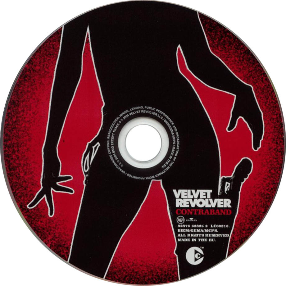
Velvet Revolver Digipack Analysis
Today I did some Digipack Analysis on Velvet Revolvers Contraband, here is what I came up with:
This will be useful when it comes to designing our own Digipack as I now understand symbols and meaning behind certain uses of images and text within a Digipack. I feel comfortable with understanding the concepts behind Rock Digipacks also.
Monday, 8 October 2012
Rock Digipack Back Covers
Subscribe to:
Posts (Atom)


.jpg)