.jpg)
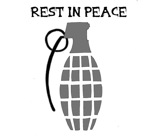
For our Inlay or inside cover we wanted to continue theme of destruction and death. We drew up the outline of a grenade as we felt the was a symbol of war representing both death and destruction that most people would recognise. We then decided to shade sections of the grenade with our blood red to give the grenade even more of a destructive feel. We also added a personal message and an "trademark" art signature to portray a more personal relation ship between artist and audience member however by inserting the text "rest in blood" we remained the inlays destructive nature.
No comments:
Post a Comment