Showing posts with label Rock. Show all posts

Sunday, 14 October 2012

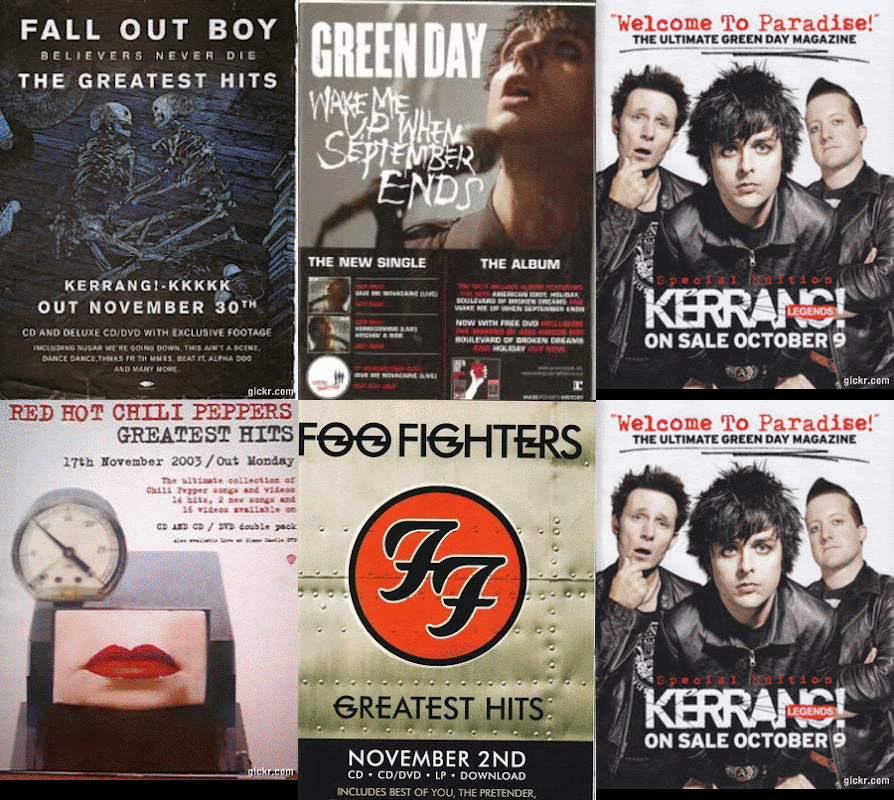
Rock Magazine Advert Analysis

Artist: Green Day
Subject: Advertising new album with three singles.
Fonts: Artist name is in the trademark Green Day font style, different font for Wake Me Up When September Ends to attract audiences eye and to compliment the meaning behind the song. Bold text for the information advertising and explaining products available.
Colours: Dominantly White, black and red. Skin tone used for the the leaders singers face which is the background for the top half of the advert.
Layout: Title of the artist at the top of the advert, products such as the album and singles, legal information, places of purchase and information about what is available and when is all strategically placed at the bottom of the advert.  
Editing Edited to show performance, lead singer is looking up to the sky this could reference the track also advertised on the advert Wake Me Up When September ends.

Artist: The Stone Roses 
Subject: Advertising the 20th anniversary of the original album by releasing a remastered version. 
Fonts: Bold fonts used to grab the audiences attention, reviews are in bold text to take pride of place and make audience members see how respected and thought of they and the new album are. 
Colours: Blue, red and white all trademark British and Stone Roses colours. 
Layout: The album and reviews are at the top of the advert, underneath is a wrap around from the album itself and then at the bottom of the advert is information and what is available and where from. 
Editing: Edited so that album is the main focus of the advert surrounded by reviews and ratings praising it. Album wrap is there so that audiences can relate the album cover to the advert and the album itself. Information about what is available is placed at the bottom discreetly to ensure audience members are aware of where they can purchase the product. 


Artist: Blink 182
Subject: Advertising new album Neighborhoods
Fonts: Distinctive font used throughout the entire advert to attract audience and also similar to text seen within the Digipack of the actual album which audiences will relate to.
Colours: Black and White
Layout: Album is centre focus of the advert, the name of the album, artist and when it is available is underneath. Bands website and legal information as well as trademark logo are all situated at the bottom of the advert. 
Editing:  Album is once again the main focus of the advert, the title of the artist can been seen within the album front cover so fans and audiences will be able to relate to this. All necessary information such as when the album is released and the the bands website is strategically placed underneath so to inform the audience whilst maintaining what the actual advert is trying to promote.

Artist: Fall Out Boy 
Subject: Advertising new Greatest Hits album
Fonts: Bold fonts to grab the audiences attention
Colours: Blue, white and black all colours which are seen on the front cover of the Greatest Hits album
Layout: The album cover is the entire background of the advert, title of the album and artist can be seen at the top and the release date and as well as whats included within the album itself can be seen at the bottom.
Editing: Simple editing with the album clearly the main focus being the background. The use of skeletons plays reference to "Believers Never Die" seen on the album front cover. Bold text is used to attract the audience and the use of short simple text easily and quickly informs audience members what they are looking at.


As a result of this analysis it is clear that the majority of Rock magazine adverts are based around an artists or bands album rather than a live performance and the album is usually situated at the top or centre of the advert with release dates, product information and legal necessities found at the bottom. We will look back at the analysis when we come to creating our advert to ensure we stick to the typical Rock Magazine advert conventions and create and authentic and professional product.

Rock Magazine Advert Research

Here is a selection of Rock Magazine Adverts I have found as part of my research in preparation for creating our own Advert for Raided By Waves;


I believe it is important to understand the concepts behind Rock Magazine Adverts so that we can better our chances of creating once again an authentic and professional product. This research has helped me in my understanding about what goes into a Rock Advert and the types of things we need to be considering when it comes to planning and creating our own. 
Friday, 12 October 2012

Analysis Rock Digipack Back Covers

I also did some Analysis of Rock Digipack Back Covers;

Artist: Foo Fighters
Album Name: Greatest Hits
Subject: Another section of the aeroplane, image enforced by the bombs at the bottom of the back cover.
Fonts: All track names in capitals like the text on the front cover. Possible bonus tracks represented with a black bomb next to them where as other tracks have an RAF roundel next to them.
Colours: Silver, black, red and blue. White for the barcode.
Composition: Bombs at the bottom of the cover could be used to signify something such as band albums, number one, tours.

Artist: Green Day
Album Name: American Idiot
Subject: Black image with track list, pin from a grenade links to the front cover of a bleeding heart shaped grenade.
Fonts: Same font used for the title of the band on the front cover.
Colours: Black, red and white.
Composition: Parental advisory expresses that the band are sticking to the Rock conventions of being rebellious, free will and for doing as they please. The grenade pin could be seen as a
Artist: The Killers 
Album Name: Hot Fuss 
Subject: Black background with track list and legal information at the bottom of the cover. 
Fonts: Small white font for the track list, each track numbered. Smaller text for legal information however 'FBI' warning is in slightly bigger black text next to barcode.
Colours: Black and white for the text, red for the spine of the album as the title "Hot Fuss" is in red. 
Composition: Simplistic design, to the point. "Previously unreleased in the US" entices audience members to purchase a sense of hidden identity and mystery is also created through the basic layout of the back cover. 

Artist: Nickleback
Album Name: All The Right Reasons
Subject: Band sitting in around car, links to the car on the front cover of the album. Track names of the right hand side of the back cover, separated
Fonts: Trademark font for spine, band name and artist album. Same font is used on the back cover for the track names, however, some of the tracks are in slightly bigger fonts. This could represent the importance or success of the song.
Colours: Blue, yellow, green, black and white as well as some red.
Composition: Reference to the front cover, could represent a 'journey' band have been on together. Lead singer is seen at the front of the image with a yellow top on making him stand out from the other band members.

From this analysis it is clear that the majority of Rock Digipack Back Covers are simple in the sense that they usually just contain the track names for the respective album, however, all keep to a similar theme to that on the front cover, most notably with the grenade pin on the back cover which displays a clear link to the grenade on the front cover. All have legal information and a barcode at the bottom. Most have the track names to the left or right of the cover. This analysis will be useful to look and when it comes to creating our own Digipack as it will help with layout, concept and inspiration as well the ability to provide with the right knowledge to create an authentic and professional product.

Analysis of Rock Digipacks

I decided to do some more detailed analysis of Rock Digipacks. Here is what I came up with:

Artist: Green Day
Album: American Idiot 
Subject: A fist holding a bleeding grenade shaped like a heart. 
Colours: White and black text, dark black background. The colours make the text and imagery stand out, they also provide an element of destruction and violence as the red blood can be seen dripping from the grenade, this is a common theme represented within the Rock genre. 
Font: Big bold fonts that stand out and grab the audiences attention. "american idiot" being the title of the album in lower case compared to 'GREEN DAY" being all in capitals to draw greater focus. 
Editing: The colours have been edited so that they stand out and enforce the imagery that is being shown, for example the heart shaped grenade being the main focus of the cover has been edited to give the effect it is bleeding to enforce the impression upon the audience that it is a heart, a heart can represent both life and death, with the heart bleeding and a common theme within Rock being death and and rebellion it is relatable to the genre. 
Symbolism: Destruction and violence shown via the bleeding grenade, rebellious towards "american" way of life. Rebelling against the norm. 
Composition: The text is on the left hand side of the image with the main focus being the hand and grenade just off centre. 
Props: Heart shaped grenade used to represent life and death. 


Artist: Foo Fighters 
Album: Greatest Hits
Subject: The bands logo, centre frame on what could be the side of an aeroplane which could have reference to the track Learn To Fly.
Location: Side of an aeroplane. 
Colours: Black and red, trademark Foo Fighter colour theme. Also use of silver as the background colour to bring out the black and red of album title and band name.
Font: Font stands out and grabs the attention of the audience, distinctive font for the logo that fans will easily recognise and be able to relate to.
Editing: Edited so the logo looks like it's on the side of an aeroplane and is a form of identity and could represent relationship between pilot and passengers (band and audience members)
Symbolism: Band fans will quickly identify with the bands logo. Logo creates artist image or identity.
Composition: Foo Fighters logo centre frame with band name at the top of the image and the title of the album at the bottom. Simple design as the band are already well established and fans and audience members will easily be able to relate to them and the type of product they produce or have produced in the past to form the greatest hits album. 

Artist: Nickelback 
Album: All The Right Reasons
Subject: Car driving down what appears to be a never ending road with either the sun setting or a storm in the background.
Location: Long endless road, during storm or whilst sun sets. 
Colours: Mixture of black for the road and white for the title of the album and also in the sky well as blue for the a dark blue for the side of the road and then orange for the sunset. Subtle colours used, nothing to overpowering. Mostly dark colours which fits into the typical Rock convention of dark clothing and a darkened image.
Font: Trademark Nickelback font that bands fans and audience members will easily relate to. Bigger font for the title of the band and smaller font for the album. All capitals, draws in audience.
Editing: The sides of the image have been edited to draw focus to the car. Looks like car is driving at some speed, time looks like it is passing which could represent how much time the band have spent on the album.
Composition: The car could play reference to the track Follow You Home on the album.
Props: The band are not seen on the front cover, creates a sense of hidden and identity, entices the audience to find out more about the artist and it's product.

Artist: Nirvana
Album: Nirvana
Subject: Title and name of the album on a black background. 
Colours: Silver text on a black background makes the text stand out to the audience.
Font: Trademark Nirvana font for the band and album name. However audience members may not be able to relate to this all that easily as it's one of the bands early products, by using this font they are created an image or insignia that if used again audiences will be able to relate to easier.
Editing: Simple design, sense of mystery created, audience members want to find out more about the band. 
Composition: One of the bands first albums, people won't know who they are so by creating a simple front cover it encourages audience members to want to find out more and by purchasing the album they get to do just that by seeing the inlays within the Digipack and listening to the bands music.

From this analysis that the majority of the Rock album front covers contain a form of band logo, artist name and album title. As a result of this, these factors will be looked a closely in preparation for creating our Rock Digipack. 

Tuesday, 9 October 2012

Velvet Revolver Digipack Analysis

Today I did some Digipack Analysis on Velvet Revolvers Contraband, here is what I came up with: 


This will be useful when it comes to designing our own Digipack as I now understand symbols and meaning behind certain uses of images and text within a Digipack. I feel comfortable with understanding the concepts behind Rock Digipacks also.

Monday, 8 October 2012

Rock Digipack Back Covers

Also I decided to look at Rock Digipack back covers, here is what I found: 


Once again this will be useful when understanding what goes into a Rock back cover. This will help when designing our own and help us to produce a more realistic and professional product.

Rock Digipack Front Covers

Today we began to process of starting our Digipack research. Here is a list of Rock album front covers that I found:


I decided It would be useful to start looking a different Rock Digipack or Album front covers to get a better idea of concept and understanding for when we come to creating our own. 

Saturday, 29 September 2012

Rock Video Performance

In order to understand better the performance aspects of Rock music videos which after some initial research I have come to understand is a huge part of Rock video conventions, I decided I would analyze a video that is purely performance to gain some inspiration as we have decided that our video will definitely contain performance aspects from Raided By Waves such as the performance of the song through instruments such as drums, guitar and vocals. I decided I would look at The Rolling Stones It's Only Rock N' Roll (But I like It) here is what I found:


Throughout the video there is use of instruments and the band can be seen performing to the camera within a studio, I have come to understand that this is a common theme within Rock music videos and is often used to compliment a variety of conventions. The setup within the video is something we are looking at closely and seriously considering using for our own video as we feel It is a good way to capture the band and also good for creating a narrative around as well as the ability to create a more professional video with the resources we have. The camera shots used within the video vary, however, there is a great emphasis on the band playing their instruments such as guitar and bass via the use of both standard and extreme close ups. There is also heavy focus on the body language and facial expressions of individual band members and the lead singer is seen moving around a lot whilst singing the lyrics into the camera adding a more personal connection with the audience. The video is all performance, however, towards the end of the video the studio is filled with bubbles while the band are performing this adds a more interesting aspect to the video which is designed to entertain the audience further. As a result of this the video is exciting to watch throughout and the use of lighting, mise en scene and delivery of vocals all help to keep the audience engaged.

This is useful to look at and understand as It will help greatly when it comes to finally deciding on how best to execute performance within our own video. This video in particular is useful as it contains a similar layout and performance aspects that we are considering using. In conclusion to this it will be extremely helpful to look back at when deciding on a final decision for our own Rock music video.

Rock Video Narrative

Narrative within the Rock genre is usually either closely linked to the performance or shot in a completely separate location. The narrative usually relates to lyrics of the song and features a personal issue such as a relationship between father and daughter, this is usually so that the audience can easily relate to the video as well as the lyrics within the song. In order to gain a better idea of concept behind narrative story lines within Rock videos and to understand better how to portray a story line to an audience I decided to look at Nickleback's How You Remind Me as this is a great example of narrative within a Rock video.


The narrative within the video is the relationship between the lead singer of the band and a girl, most likely an ex girlfriend. There are a series of flashbacks or memories throughout the video in which the lead singer is seen remembering the girl and imagines seeing or being with her which links reference to the connection between narrative, lyrics and title of the song "how you remind me". In one particular memory the girl is seen to be extremely flirtatious with the lead singer which is the sort of relationship we are thinking of portraying within our own video. The color between the memories and reality has been edited so that what is being shown in the present time is  that of warm colors almost a shade of yellow and presents a positive vibe where as the memories are  more of a cold blue/grey that give the impression they are seen as more negative. There are also several lyric's that relate to the narrative such as "i said i love you and i swear i still do" as well as "how you remind me, of what I really am" as he is seen within one of the memories or flashbacks remembering the girl. Towards the end of the video, the narrative meets the performance in the sense that the studio or building that the performance had been filmed in, the girl is now seen in the same room with the lead singer and then the audience however the story changes when the lead singer pushes back the girl and walks away from her during one of the memories giving the impression he is done with her reminding him of what he used to be. This ending is interesting as we are thinking about a similar ending where a girl gets left behind. The overall impression of the video is a relationship gone sour and the lead singer is remember old memories and how he "used to be" when in the relationship with the girl.

It is important to understand narrative concepts with Rock videos as it will be useful when designing and creating our own, it also important to look at this particular video as it portrays a similar narrative to the one we are thinking about using. This will be good to look back on nevertheless for future reference.

Thursday, 20 September 2012

Stereotypical Rock Videos

The Rock genre is a genre of music that's roots originate from "rock and roll" back in the 1950's which eventually developed into different variations of this style during the 1960's particularly in the United Kingdom and the United States. Rock is mostly about rebellious behaviour and violence, other key features usually associated with rock are women and packed out stadiums as well as live performance and the playing of instruments such as guitar and drums. Rock has developed dramatically over the years with costume being the most notable change,  however, these core elements of the Rock genre remain. In order for me to fully understand the concept of rock and a typical classic rock video I decided to create a post about a variety of rock music videos, both old and modern. 


Bon Jovi's video to Livin' On A Prayer is a classic Rock video in the sense that it contains a 'behind the scenes' narrative as well as main focus of performance. However the narrative of the band messing about whilst rehearsing and setting up can be seen throughout the majority of the video, a black and white effect has also been placed over this footage in order to separate it from performance. This can be seen in other rock videos such as Def Leppards Pour Some Sugar On Me. The Mise en Scene within the video represents true Rock, the band members are seen wearing Rock attire such as leather jackets, vests, shirts, tight black trousers as well as boots and the long Rock hairstyle is also visible within the video. The choice of costume makes them look like true Rockstars. The cutting rate of the video is done so that the song cuts on the beat, this effective as it feels as if the video running in sync with song. The focus on the use instruments is a key convention of Rock and Rock videos, there are a variety of camera shots focusing on the use of drums, guitar and vocals throughout the video. The fact that the band end up playing in front an audience also relates to a key convention of Rock, performing on stage.   The performance at the end of the video could also portray the type of lifestyle the band lead as they are seen being mobbed by screaming fans, this could relate to their huge global audience and fan base. This is something commonly associated with Rock and what most Rock bands aspire to.  


Van Halen's video for Jump is slightly different as for the entire duration the band are performing, not only this video is also in colour. As well as this the band are not seen performing to an audience and are instead seen performing into the camera which could be instead be interpreted as the band performing to an audience through the camera. The Mise en Scene within the video is slightly different to most Rock videos, although the band are seen to wearing similar clothing to that seen is most Rock videos such as tight leather trousers, vests, t-shirts and boots the colours of the attire are that mostly of bright orange which is not a colour commonly associated with most Rock videos. Nevertheless the band still pull of the Rock band look convincingly. The cutting rate is quite slow however speeds up during certain parts of the song to add effect to certain lyrics. Although the video is performance based the band are still seen joking around together, this is shown through a variety of close ups and focus on the playing of instruments such as bass which as previously mentioned is key convention of Rock. The performance during the video could also portray the type of lifestyle the band lead as they are seen having fun and enjoying what they do, this could relate to their love for performing and how it makes them behave. This again is something that is commonly associated within the Rock genre and something most Rock bands aspire to achieve.  


Finally in Nickleback's video for I'd Come For You there is both performance and a separate narrative storyline. The storyline or narrative is about a daughter running away from her father with a boy who then attacks her and then dad is seen coming to her rescue. This theme of relationships as well as the saving of the day has become more popular within Rock music videos over the past few years. The Mise en Scene seen within this video is more modern however core elements of Rock are still present through the band that are seen all dressed in black jeans, t-shirts and shirts as well as boots when performing in a studio. The cutting rate compliments the narrative and performance cutting at convenient moments so shots don't become boring or to drawn out, the cutting rate is also used to create drama when the girl is being attacked. There are a variety of camera shots such as close ups and long shots used to focus on the playing of instruments when the band are shown performing in the studio which is key convention of Rock. There are also a number of camera shots used to tell the story of the narrative for example medium and close up shots when the girl is sitting in the boys car before she is attacked this is useful when setting a scene or trying to explain whats happening without the use of dialogue. The video also compliments the lyrics of the song, as the video matches the message behind the lyrics of the song, this is something that is used in Rock videos from time to time especially when narrative is involved. 

It is important to have an understanding of the types of videos that are commonly produced within the Rock genre at is will help us greatly with overall concept of our own video and also provide us with evidence for justifying certain choices when designing and creating our product for Secret Sin. We can also look back to these videos for inspiration.

Research Into Rock Genre Conventions

Today I decided to create a more detailed post about the key genre conventions of Rock. This will of great use to us when to comes to designing and creating our music video. After looking at a variety of music videos from the Rock genre, here is what I found.

Camera's Used

Most rock video's feature some form or journey or behind the scenes footage. This makes the band look more approachable and is exciting for audiences to watch and enjoy. Rock videos are usually shot with a mixture of cameras from handheld to add an authentic concert feel, to powerful HD cameras to capture the band performing or on stage.

Shot Types 

Rock videos usually contain a variety of shot types from extreme close ups to long shots, with the use of handheld shots and well as heavy focus on the playing of instruments as well as lip sync. These are very important within a rock video.


Costume Worn

Most artists within the Rock genre are male, as result of this the costume worn is usually jeans, shirts  and T-shirts often seen worn by the likes of Nickleback however, The Killers are often seen wearing blazers also. The type of costume that used to be seen a lot in Rock music videos was skin tight lycra, tights and vests this was seen as very Rock and Roll and was extremely fashionable. Nowadays artists are usually seen wearing similar clothing, thats simple for example a whole band may be wearing black T-shirts with jeans. Most of what is worn an audience can relate to, an example of jeans that might be worn by Rockstars of today might be Levi. 


Editing Techniques 

Usually cutting between behind the scenes and performance, cutting on the beat to keep the tempo and mood of the video consistent. Special effects are sometimes used to add more of a dynamic edge to the video.

Props

There aren't many props within Rock videos, however, instruments could be classed as a prop of which there are many such as guitar and drums. However some rock music videos to contain a mixture of props for example the video for Red Hot Chili Peppers Can't Stop contains a variety of props such a lights and wheelie bins. Amplifiers are often used as props as well as mic stands and drum risers.

Locations Used 

Rock music videos usually contain one or two locations, mostly backstage or setting up as well as live performance. However sometimes Rock videos are based in a studio such as Foo Fighters The Pretender. Not only this but some Rock videos are also at a party or outside such as Nickleback's This Afternoon.

Instruments 


There are a number of instruments commonly found within Rock videos, these consist of drums, guitar, bass guitar as well as keyboards and microphones. There is often heavy focus on the playing of these instruments so they are key to the making of a good video. Some artists may use a synth or two lead guitars. There are variety of instrument combinations that can be found within Rock music videos.

Lighting 

There is often bright lots of bright lights and flashes seen in Rock videos especially when the band is performing. Sometimes lighting is enhanced with the use of special effects to create more of a concert feel. The colours within Rock videos are usually dark and deep and are used to create the mood or tempo of a particular video.

Overall Impression 

Most artists within Rock videos give off the impression they are living the dream, always smiling and loving what they're doing. Most narratives are the band having fun behind the scenes and enjoying their performance to audiences. This is usually included in Rock music videos to appeal to the target audience so they can relate with the artist as many Rock fans are also in their own band. Rock stars are also seen as being free and being able to do whatever they please. 

From this I have be able to learn more about the details behind Rock videos and how they are put together as well as the types of shots, props and general concept of a Rock music video. This will very useful when it comes to creating own as I will have a better understanding of how they work and I will be able to pass this onto the rest of my group. 

Monday, 17 September 2012

What is Rock?

I decided to make a short post defining Rock.

Rock is sometimes known as Rock and Roll and is a style of music that rose to fame in the 1950's and 60's mainly in the US and Europe. It focuses mainly on older music styles such as rhythm and blues with a particularly heavy focus on the use of guitar, drums and vocals. Rock has led the way for musicians such as Queen, Def Leppard, Bon Jovi and more modern artists such as The Killers. Rock has evolved dramatically over the years with changes in appearances and modification of sound being the most notable for example 10 minute solos are not as widely popular as they used to be during the ages of Guns N' Roses. Having said this the core elements of Rock remain with bands performing in front of sold out stadiums and great sex appeal that most Rock bands used to be renowned for is still evident today. Having said this Rock music videos are more popular and common within the genre, however still portray 'behind the scenes' footage which was commonly used in early videos such as Def Leppard's Pour Some Sugar On Me. Rock bands or musicians are also not portrayed as rebellious at they once were however it could be argued that Green Day and The Pretty Reckless are an exception to this.

It is important to understand a general concept of Rock and what Rock is so for future reference throughout the coursework. This is also something I can look back at and develop in future posts.

Genre Choice Update

As a group we have reached a decision in which we have decided to turn our backs on the Dubstep Genre and Instead switch to the Genre of Rock. There are a variety of reasons for doing this and these include the fact that we aren't able to have Modestep perform for us, while this is completely understandable, as a group we decided that we wanted the band who owns the song to perform it also for continuity reasons and so on. We also decided that although Dubstep Genre allowed us to be creative, we felt as if creating a video with a narrative and a video that had a sense of meaning would be extremely difficult.

As a result of this, we have since adopted Rock as our chosen Genre. We decided to choose this Genre as like Dubstep, each member of our group has an extended knowledge of Rock. As a group we also know a variety of bands within the Rock industry which will be helpful when choosing a new artist and song for our music video, digipack and magazine article.

I believe that by making this decision to change Genre's we are actually now giving ourselves a much better chance of creating a video that has a lot more meaning still using all our creative skills and In doing so enables us to gain higher marks.

Saturday, 23 June 2012

Tenacious D Rise of the Fenix Digipack Analysis

I decided to post a picture of some Digipack analysis I did for the album Rise of the Fenix by Tenacious D. Here is my analysis: 


It is important to analyse a variety of different Digipacks to gain a wider range of knowledge about how various signs and symbols within them and what they can be interpreted as meaning. Not only this but learning how genre effects the style and conventions of a Digipack will also be important when it comes to designing my own. 

Friday, 22 June 2012

Nirvana Smells Like Teen Spirit Analysis


In the video "Smells Like Teen Spirit" by Nirvana is set in a school gym and given a sepia filter effect throughout, what this does is help the audience link to the lyrics to the actual location and setting of the video, the stereotypical view of teenagers being rebellious or unclean. The genre of which this video and Nirvana come from is Rock and the rebellious attitudes shown in this video symbolise stereotypical conventions from the rock genre such as crow surfing and mosh pits, heavy focus on drums, a guitar solo and the destroying of instruments. Not only this but the Mise en Scene of the video also draws focus to Rock Genre with the instruments in which the band are playing such as drums, guitar and bass. As well as this, the costumes featured in the video represent that of Rock but also have a clear link to the actual title of the song and that lyrics as the majority of people in the video are "teenagers" they are seen to be wearing jeans and t-shirts, something that was very popular within the genre at the time this video was released. Not only this but there also a group of cheerleaders that can be seen in the video wearing stereotypical costume, this helps to emphasise the location of the video being at a school or high school. As a result of this also, the target audience for this particular artist and the song it's self would be between 16-24,  both "teenagers" and students. The cutting rate in this video is that of a typical rock video, cutting between the performance of the band and the crowd moshing throughout the majority of the video. The image of the band in this video is one that agains fits into the title and the lyrics of the song, with them looking similar to the teenage crowd and with the band acting rebellious by causing destruction in the schools gym this could be seen as very stereotypical both within Rock itself with it's destructive reputation but also with rebellious teenagers within school. Both the band and crowd are seen to also be wearing quite dark clothing as well which fits in with the setting of the video. The performance the band give throughout the video again is that of a typical Rock concert, whereby after each chorus the band gets the crowd moving more and more until eventually the song ends and the band destroy there instruments, something which again may appeal more to teenagers. Throughout the video I believe that the band whilst causing destruction are also portrayed as very likeable and respected people especially within the world of Rock with the close up shots of the crowd moshing and the band playing there instruments. Kurt Cobain can be seen singing into the camera as well during the video, making the video feel more personal as if he is singing to not just the audience in the video but and audience watching the video. The video contains a fast cutting rate with a variety of different shots, such as close ups, long shots and also high angle shots and a panning shot at the start of of the video to set the scene which keeps the audience interested in the video. There is also a variety of shots that show a cleaner dancing to the music, he is very much older than anyone else in the video, what this may represent is an older generation reminiscing or wanting to re-discover there youth.


The Killers - Somebody Told Me Analysis

One of the most common ways In which artists are portrayed or represented is through their music videos so I decided to analyse some as I will eventually have to create my very own music video for my coursework. I decide to analyse The Killers - Somebody Told Me: 


The video is set in desert in which the band can be seen playing into the early morning. There is only one location throughout the video and the Mise en scene remains the same for the duration of the song. The Mise en Scene is mix of classic rock with jeans and t-shirts and more 21st century rock in the sense there are also members of the band wearing blazers, cardigans and a polo shirt. The majority of the video is purely the band performing with the main focus on the lead singer. However there are cuts to silhouettes of women dancing in-front of a screen lit up by the bands name, this occurs mainly in the chorus. This could represent a link to the lyrics when it says "I had a girlfriend" connecting the song to the women in the video, the placement of these women and their actions will also appeal to male viewers as It implies sex appeal, where as the band themselves may appeal more towards a female audience. There is a very fast cutting rate at the start of the video before the lyrics begin and before the lead singer has properly been introduced, this could be done to create suspense and excitement for the audience as they will be eager to the performance to begin. The band can also been seen as silhouettes at the start of the video, this could be linked to the silhouettes of the women later on and could portray that they are similar linking In with the lyric "you had a boyfriend that looked like a girlfriend". In the background of the video there Is a footage of the band playing to the song In the day time as well as a "Killers" light-show, this could imply that the band having been playing although the day and are playing into the night, not only this but the "Killers" imagery could be in place to make sure people know who they are by the end of the video if they didn't already. The images of the band playing during the day creates the impression that the band are hardworking or even "hardcore" a classic convention of the rock genre, which will appeal to their audience greatly. The performance is very lively from the lead singers point of view, he is seen to be moving around a lot during the video this could be emphasise that he is the lead and the attention should be drawn to him. Their is also heavy focus on the drummer, another classic rock convention. The band look at the camera on several occasions throughout the performance giving the video a more personal feel. The lighting used in the video appears to be low lit spotlighting this is a clever way of drawing focus to certain aspects of the performance. The positioning of the band is also that of a classic Rock band with the drummer at the back, lead in the middle and the two guitarist either side, The true rock audience will be able to relate to this. Throughout the video there are a range of different shots such as close ups, long and medium shots as well as low and high angle shows also, what this does is create a more interesting and enjoyable performance via a variety of different aspects. When the video reaches the end and the band finish performing it gives the impression they have just finished a concert, this could be to try and encourage the audience to see them live as the type of performance seen in the video is how they will perform live at a concert. Overall I believe the video works well, although the video is more Pop Rock than true Rock it is still a very clever and successful use of lyrics, performance, editing, Mise en Scene and sound. 

It is useful to look at music videos, to understand more about artists and how they are portrayed through their own videos. This will be very helpful for me when it comes to creating my own music video, I will look to videos such as this one If I were to choose the genre of Rock.