Showing posts with label Research. Show all posts
Showing posts with label Research. Show all posts
Saturday, 17 November 2012
Digipack and Advert Update
We are in the process of creating our Digipack and Advert, we are using our research as inspiration and justification behind our design choices. We have chosen or created images that we have either taken or designed from scratch that we feel truly compliment Rock Digipack and Advert conventions as well as applying our own original thoughts and ideas. We will post our progress accordingly.
Friday, 2 November 2012
Group Name
We have chosen a group name, we have decided to call ourselves Lithium Studios. We decided on this name as a result of a few simple things such as the fact that Lithium is sometimes used as antidepressant and we thought this linked well to the genre of Rock and how people often listen to music and especially Rock as an act of escapism and the fact that Lithium is also well known song by Nirvana a well known Rock band.
Sunday, 21 October 2012
Digipack Fonts Research
After researching the concept for our Digipack CD artwork I felt it was just as important to start thinking about the types of fonts that would should use. Most Rock Digipacks feature bold texts that stand out and grab the audiences attention and this is something we need to consider seriously when planning our Digipack. We also want our font to look appealing to audiences and also represent some of the key conventions within the Rock genre. I went onto dafont.com and came up with a list of fonts that we could potentially use. Here is what I found:


I personally believe that by researching different types of font's and assessing what we can use within our Digipack will give us a much better chance of creating a more realistic as well as professional piece of work.
Digipack CD Artwork
After looking at a number of CD's artwork it is clear that the majority of Rock Digipacks contain a form of band imagery or logo and have a strong relation to the front cover or rest of the Digipack. As a result of this we will be incorporating this concept into our own Digipack that we will be creating for Raided By Waves. We plan to use an image that thinks directly towards either the front or the back cover and we also want it contain a form of band imagery such as a logo. The colours will also compliment the rest of the Digipack.
The research I did into Rock Digipacks has being useful in coming up with a concept for our Digipack.
Digipack CD Artwork Research
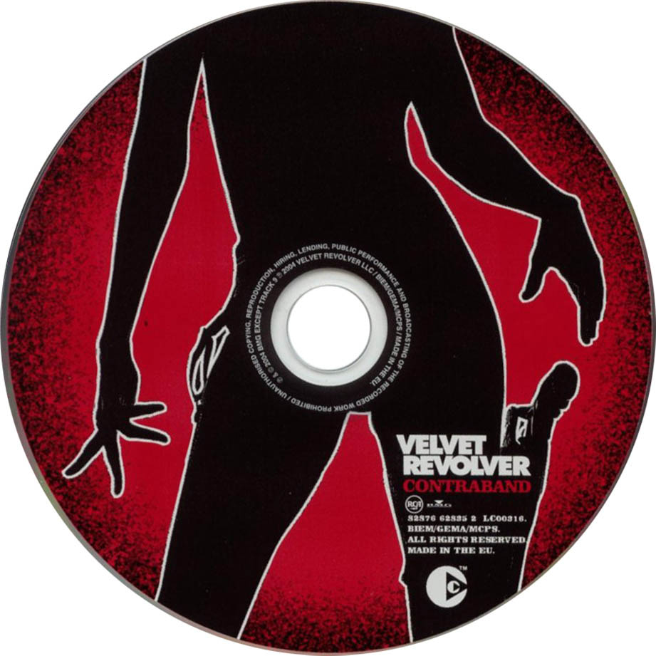
Here are a number of CD artworks that I have also looked at in preparation for the designing and creatiion of our own Rock Digipack for Raided By Waves.


This is important because again provides me with the understanding and conceptual knowledge I will need when it comes to planning and creating our own CD artwork for our Digipack.


This is important because again provides me with the understanding and conceptual knowledge I will need when it comes to planning and creating our own CD artwork for our Digipack.
Friday, 19 October 2012
Music Video Equipment
In order to make our video as authentic and professional as possible, whilst sticking to our Rock conventions we want to be able to use the best equipment available.
As a result of being able to film at the MTV studios in London we will also gain access to their equipment. We will be using their HD professional cameras which will help us to create a more high quality video as the cameras should be easy to operate and give us the best chance of capturing the footage we need , their lighting set up which we will be able to use to create our own lighting design for the video to help set the mood and tone, the dolly's for each individual camera which will enable us to capture a variety of shots as well as a vision mixer which means we will be able to line up different shots and practically edit on the go. We also plan to use the school iMacs to edit our finished video, we used these devices last year and are all comfortable with using them. Finally we also plan on taking a HDD with us to store our footage on and having a PA system set up in the studio so that we can play the song into the studio for the band to play along to when filming the video. We hope that as a result of all this we will be able to create the correct type of video for our genre as well as professional and realistic product.
As a result of being able to film at the MTV studios in London we will also gain access to their equipment. We will be using their HD professional cameras which will help us to create a more high quality video as the cameras should be easy to operate and give us the best chance of capturing the footage we need , their lighting set up which we will be able to use to create our own lighting design for the video to help set the mood and tone, the dolly's for each individual camera which will enable us to capture a variety of shots as well as a vision mixer which means we will be able to line up different shots and practically edit on the go. We also plan to use the school iMacs to edit our finished video, we used these devices last year and are all comfortable with using them. Finally we also plan on taking a HDD with us to store our footage on and having a PA system set up in the studio so that we can play the song into the studio for the band to play along to when filming the video. We hope that as a result of all this we will be able to create the correct type of video for our genre as well as professional and realistic product.
Travel
Here is our planned route of travel during our filming day.
Address: 17-29 Hawley Crescent, London, Greater London NW1 8TT
Train Travel:
Overground train service from Bishops Stortford to London Liverpool Street (estimated around 40 minutes)
Circle line underground train service from London Liverpool Street (estimated around 3 minutes)
Northern line underground train service from Moorgate to Camden Town (estimated around 7-9 minutes)
Here are some images of the routes paths we will be taking:


It is important to know how we are going to get to MTV as to ensure we are not late and do not disrupt our schedule or shorten our filming process by not showing up on time.
Music Video Risk Assessment
Just like in our Preliminary Task, I decided to write a Risk Assessment for the filming of our Music Video.

Location - Travelling to and across London to MTV
Risk - Could get lost or get attacked, hit when crossing roads
What we can do to reduce the risk - Always have someone on standby with a mobile phone in case of emergency and ensure we take a map with us so incase we get lost we can easily recalculate our route accordingly. Watch out for traffic when crossing roads.
Location - MTV Studios
Risk - Fire
What we can do to reduce the risk - Make sure that we know where all the fire exits are and are briefed about the companies fire drill policy. Always have someone on standby with a mobile phone in case of emergency.
Location - MTV Studios
Risk - Tripping over something, or falling over.
What we can do to reduce the risk - Remove anything within the studio that might cause a trip hazard such as lose cable. Always have someone on standby with a mobile phone in case of emergency.
Location - MTV Studios
Risk - Possible electrocution from equipment
What we can do to reduce the risk - Make sure all equipment as being fully tested and is in full working order. Always have someone on standby with a mobile phone in case of emergency.
It is important to wary of any risks involved when we go to film at MTV. I believe this Risk Assessment will certainly help us to remain safe whilst on our way to MTV and whilst filming.

Location - Travelling to and across London to MTV
Risk - Could get lost or get attacked, hit when crossing roads
What we can do to reduce the risk - Always have someone on standby with a mobile phone in case of emergency and ensure we take a map with us so incase we get lost we can easily recalculate our route accordingly. Watch out for traffic when crossing roads.
Location - MTV Studios
Risk - Fire
What we can do to reduce the risk - Make sure that we know where all the fire exits are and are briefed about the companies fire drill policy. Always have someone on standby with a mobile phone in case of emergency.
Location - MTV Studios
Risk - Tripping over something, or falling over.
What we can do to reduce the risk - Remove anything within the studio that might cause a trip hazard such as lose cable. Always have someone on standby with a mobile phone in case of emergency.
Risk - Possible electrocution from equipment
What we can do to reduce the risk - Make sure all equipment as being fully tested and is in full working order. Always have someone on standby with a mobile phone in case of emergency.
It is important to wary of any risks involved when we go to film at MTV. I believe this Risk Assessment will certainly help us to remain safe whilst on our way to MTV and whilst filming.
Thursday, 18 October 2012
Music Video Props
There are a number of props we plan to include within our Music Video, these are;
Instruments such as Guitar, Bass and Drums for the band to play during the video for the performance of Secret Sin.


Microphone with stand for James to sing the lyrics of the song into when performing.


Headset and clipboard for Lucy to make her more realistic in her role as a sound/runner girl.


All of these props will be important in creating a professional and realistic video as each of them are either vital parts of the performance or narrative.
Instruments such as Guitar, Bass and Drums for the band to play during the video for the performance of Secret Sin.


Microphone with stand for James to sing the lyrics of the song into when performing.

Amplifiers for the band to plug their instruments into as well as helping the video look more authentic and Rock as a result.

Headset and clipboard for Lucy to make her more realistic in her role as a sound/runner girl.


All of these props will be important in creating a professional and realistic video as each of them are either vital parts of the performance or narrative.
Music Video Costume
In order for our artist/actors to present themselves authentically the Mise en Scene and type of clothing that each member of the video wears is very important. We plan to dress our band members in mostly black, this fits into the title of the song "Secret Sin" insinuating there is something to hide and to compliment the overall dark theme we are going for within the video. Not only this but modern Rock bands such as Green Day, Foo Fighters, Lost Prophets and Nickleback are often seen sporting black coloured attire during music videos and live performances such as t-shirts, ripped jeans and vests. We also plan to dress Lucy in a black with addition of black boots and a sleeveless top to show off her tattoos as we feel this an effective way of portraying her as the "Rock chick" runner girl we are trying to create.


As the video is indoors the band will be seen black t-shirts, perhaps with some form of logo or insignia on as this is popular within Rock, dark skinny jeans as well as black shoes such as vans, converse or boots as these items of clothing are all extremely popular among modern Rock bands not only this but the bands fans and audience members will be able to relate to these choices of costume especially items such as skinny jeans and vans as a lot of them will often wear the same thing. We also plan to dress one of the band members in a scarf as this is something that represents "classic" or "old school" Rock and can be seen being worn by the frontman of the video for Bon Jovi Livin' On A Prayer.


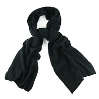

As the video is indoors the band will be seen black t-shirts, perhaps with some form of logo or insignia on as this is popular within Rock, dark skinny jeans as well as black shoes such as vans, converse or boots as these items of clothing are all extremely popular among modern Rock bands not only this but the bands fans and audience members will be able to relate to these choices of costume especially items such as skinny jeans and vans as a lot of them will often wear the same thing. We also plan to dress one of the band members in a scarf as this is something that represents "classic" or "old school" Rock and can be seen being worn by the frontman of the video for Bon Jovi Livin' On A Prayer.


Tuesday, 16 October 2012
Music Video Location
The location for our Music Video is the MTV Studios in London. Here is there address:
17-29 Hawley Crescent
Camden
London
NW1 8TT

We will be using their studio on the 22nd and 23rd October to set up and film our video. This choice of venue will help us to create the video that we are aiming to produce as well as the ability produce a more accurate and professional video as a result.
Sunday, 14 October 2012
Rock Magazine Advert Analysis
 Artist: Green Day
Subject: Advertising new album with three singles.
Fonts: Artist name is in the trademark Green Day font style, different font for Wake Me Up When September Ends to attract audiences eye and to compliment the meaning behind the song. Bold text for the information advertising and explaining products available.
Colours: Dominantly White, black and red. Skin tone used for the the leaders singers face which is the background for the top half of the advert.
Layout: Title of the artist at the top of the advert, products such as the album and singles, legal information, places of purchase and information about what is available and when is all strategically placed at the bottom of the advert.
Editing Edited to show performance, lead singer is looking up to the sky this could reference the track also advertised on the advert Wake Me Up When September ends.

Artist: The Stone Roses
Subject: Advertising the 20th anniversary of the original album by releasing a remastered version.
Fonts: Bold fonts used to grab the audiences attention, reviews are in bold text to take pride of place and make audience members see how respected and thought of they and the new album are.
Colours: Blue, red and white all trademark British and Stone Roses colours.
Layout: The album and reviews are at the top of the advert, underneath is a wrap around from the album itself and then at the bottom of the advert is information and what is available and where from.
Editing: Edited so that album is the main focus of the advert surrounded by reviews and ratings praising it. Album wrap is there so that audiences can relate the album cover to the advert and the album itself. Information about what is available is placed at the bottom discreetly to ensure audience members are aware of where they can purchase the product.

Subject: Advertising new album Neighborhoods
Fonts: Distinctive font used throughout the entire advert to attract audience and also similar to text seen within the Digipack of the actual album which audiences will relate to.
Colours: Black and White
Layout: Album is centre focus of the advert, the name of the album, artist and when it is available is underneath. Bands website and legal information as well as trademark logo are all situated at the bottom of the advert.
Editing: Album is once again the main focus of the advert, the title of the artist can been seen within the album front cover so fans and audiences will be able to relate to this. All necessary information such as when the album is released and the the bands website is strategically placed underneath so to inform the audience whilst maintaining what the actual advert is trying to promote.

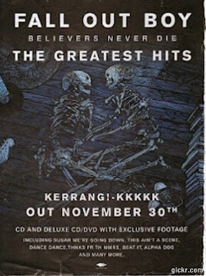
Subject: Advertising new Greatest Hits album
Fonts: Bold fonts to grab the audiences attention
Colours: Blue, white and black all colours which are seen on the front cover of the Greatest Hits album
Layout: The album cover is the entire background of the advert, title of the album and artist can be seen at the top and the release date and as well as whats included within the album itself can be seen at the bottom.
Editing: Simple editing with the album clearly the main focus being the background. The use of skeletons plays reference to "Believers Never Die" seen on the album front cover. Bold text is used to attract the audience and the use of short simple text easily and quickly informs audience members what they are looking at.
As a result of this analysis it is clear that the majority of Rock magazine adverts are based around an artists or bands album rather than a live performance and the album is usually situated at the top or centre of the advert with release dates, product information and legal necessities found at the bottom. We will look back at the analysis when we come to creating our advert to ensure we stick to the typical Rock Magazine advert conventions and create and authentic and professional product.
Rock Magazine Advert Research
Here is a selection of Rock Magazine Adverts I have found as part of my research in preparation for creating our own Advert for Raided By Waves;


I believe it is important to understand the concepts behind Rock Magazine Adverts so that we can better our chances of creating once again an authentic and professional product. This research has helped me in my understanding about what goes into a Rock Advert and the types of things we need to be considering when it comes to planning and creating our own.
Friday, 12 October 2012
Analysis Rock Digipack Back Covers
I also did some Analysis of Rock Digipack Back Covers;
 Artist: Foo Fighters
Album Name: Greatest Hits
Subject: Another section of the aeroplane, image enforced by the bombs at the bottom of the back cover.
Fonts: All track names in capitals like the text on the front cover. Possible bonus tracks represented with a black bomb next to them where as other tracks have an RAF roundel next to them.
Colours: Silver, black, red and blue. White for the barcode.
Composition: Bombs at the bottom of the cover could be used to signify something such as band albums, number one, tours.
 Artist: Green Day
Album Name: American Idiot
Subject: Black image with track list, pin from a grenade links to the front cover of a bleeding heart shaped grenade.
Fonts: Same font used for the title of the band on the front cover.
Colours: Black, red and white.
Composition: Parental advisory expresses that the band are sticking to the Rock conventions of being rebellious, free will and for doing as they please. The grenade pin could be seen as a

 Artist: Nickleback
Album Name: All The Right Reasons
Subject: Band sitting in around car, links to the car on the front cover of the album. Track names of the right hand side of the back cover, separated
Fonts: Trademark font for spine, band name and artist album. Same font is used on the back cover for the track names, however, some of the tracks are in slightly bigger fonts. This could represent the importance or success of the song.
Colours: Blue, yellow, green, black and white as well as some red.
Composition: Reference to the front cover, could represent a 'journey' band have been on together. Lead singer is seen at the front of the image with a yellow top on making him stand out from the other band members.
From this analysis it is clear that the majority of Rock Digipack Back Covers are simple in the sense that they usually just contain the track names for the respective album, however, all keep to a similar theme to that on the front cover, most notably with the grenade pin on the back cover which displays a clear link to the grenade on the front cover. All have legal information and a barcode at the bottom. Most have the track names to the left or right of the cover. This analysis will be useful to look and when it comes to creating our own Digipack as it will help with layout, concept and inspiration as well the ability to provide with the right knowledge to create an authentic and professional product.

Album Name: Greatest Hits
Subject: Another section of the aeroplane, image enforced by the bombs at the bottom of the back cover.
Fonts: All track names in capitals like the text on the front cover. Possible bonus tracks represented with a black bomb next to them where as other tracks have an RAF roundel next to them.
Colours: Silver, black, red and blue. White for the barcode.
Composition: Bombs at the bottom of the cover could be used to signify something such as band albums, number one, tours.

Album Name: American Idiot
Subject: Black image with track list, pin from a grenade links to the front cover of a bleeding heart shaped grenade.
Fonts: Same font used for the title of the band on the front cover.
Colours: Black, red and white.
Composition: Parental advisory expresses that the band are sticking to the Rock conventions of being rebellious, free will and for doing as they please. The grenade pin could be seen as a

Artist: The Killers
Album Name: Hot Fuss
Subject: Black background with track list and legal information at the bottom of the cover.
Fonts: Small white font for the track list, each track numbered. Smaller text for legal information however 'FBI' warning is in slightly bigger black text next to barcode.
Colours: Black and white for the text, red for the spine of the album as the title "Hot Fuss" is in red.
Composition: Simplistic design, to the point. "Previously unreleased in the US" entices audience members to purchase a sense of hidden identity and mystery is also created through the basic layout of the back cover.

Album Name: All The Right Reasons
Subject: Band sitting in around car, links to the car on the front cover of the album. Track names of the right hand side of the back cover, separated
Fonts: Trademark font for spine, band name and artist album. Same font is used on the back cover for the track names, however, some of the tracks are in slightly bigger fonts. This could represent the importance or success of the song.
Colours: Blue, yellow, green, black and white as well as some red.
Composition: Reference to the front cover, could represent a 'journey' band have been on together. Lead singer is seen at the front of the image with a yellow top on making him stand out from the other band members.
From this analysis it is clear that the majority of Rock Digipack Back Covers are simple in the sense that they usually just contain the track names for the respective album, however, all keep to a similar theme to that on the front cover, most notably with the grenade pin on the back cover which displays a clear link to the grenade on the front cover. All have legal information and a barcode at the bottom. Most have the track names to the left or right of the cover. This analysis will be useful to look and when it comes to creating our own Digipack as it will help with layout, concept and inspiration as well the ability to provide with the right knowledge to create an authentic and professional product.
Analysis of Rock Digipacks
I decided to do some more detailed analysis of Rock Digipacks. Here is what I came up with:
 Artist: Green Day

.jpg) Artist: Nickelback
Artist: Nickelback
 Artist: Nirvana
From this analysis that the majority of the Rock album front covers contain a form of band logo, artist name and album title. As a result of this, these factors will be looked a closely in preparation for creating our Rock Digipack.
 Artist: Green Day
Album: American Idiot
Subject: A fist holding a bleeding grenade shaped like a heart.
Colours: White and black text, dark black background. The colours make the text and imagery stand out, they also provide an element of destruction and violence as the red blood can be seen dripping from the grenade, this is a common theme represented within the Rock genre.
Font: Big bold fonts that stand out and grab the audiences attention. "american idiot" being the title of the album in lower case compared to 'GREEN DAY" being all in capitals to draw greater focus.
Editing: The colours have been edited so that they stand out and enforce the imagery that is being shown, for example the heart shaped grenade being the main focus of the cover has been edited to give the effect it is bleeding to enforce the impression upon the audience that it is a heart, a heart can represent both life and death, with the heart bleeding and a common theme within Rock being death and and rebellion it is relatable to the genre.
Symbolism: Destruction and violence shown via the bleeding grenade, rebellious towards "american" way of life. Rebelling against the norm.
Composition: The text is on the left hand side of the image with the main focus being the hand and grenade just off centre.
Props: Heart shaped grenade used to represent life and death.

Artist: Foo Fighters
Album: Greatest Hits
Subject: The bands logo, centre frame on what could be the side of an aeroplane which could have reference to the track Learn To Fly.
Location: Side of an aeroplane.
Location: Side of an aeroplane.
Colours: Black and red, trademark Foo Fighter colour theme. Also use of silver as the background colour to bring out the black and red of album title and band name.
Font: Font stands out and grabs the attention of the audience, distinctive font for the logo that fans will easily recognise and be able to relate to.
Editing: Edited so the logo looks like it's on the side of an aeroplane and is a form of identity and could represent relationship between pilot and passengers (band and audience members)
Symbolism: Band fans will quickly identify with the bands logo. Logo creates artist image or identity.
Composition: Foo Fighters logo centre frame with band name at the top of the image and the title of the album at the bottom. Simple design as the band are already well established and fans and audience members will easily be able to relate to them and the type of product they produce or have produced in the past to form the greatest hits album.
.jpg) Artist: Nickelback
Artist: Nickelback
Album: All The Right Reasons
Subject: Car driving down what appears to be a never ending road with either the sun setting or a storm in the background.
Location: Long endless road, during storm or whilst sun sets.
Location: Long endless road, during storm or whilst sun sets.
Colours: Mixture of black for the road and white for the title of the album and also in the sky well as blue for the a dark blue for the side of the road and then orange for the sunset. Subtle colours used, nothing to overpowering. Mostly dark colours which fits into the typical Rock convention of dark clothing and a darkened image.
Font: Trademark Nickelback font that bands fans and audience members will easily relate to. Bigger font for the title of the band and smaller font for the album. All capitals, draws in audience.
Editing: The sides of the image have been edited to draw focus to the car. Looks like car is driving at some speed, time looks like it is passing which could represent how much time the band have spent on the album.
Composition: The car could play reference to the track Follow You Home on the album.
Props: The band are not seen on the front cover, creates a sense of hidden and identity, entices the audience to find out more about the artist and it's product.
 Artist: Nirvana
Album: Nirvana
Subject: Title and name of the album on a black background.
Colours: Silver text on a black background makes the text stand out to the audience.
Font: Trademark Nirvana font for the band and album name. However audience members may not be able to relate to this all that easily as it's one of the bands early products, by using this font they are created an image or insignia that if used again audiences will be able to relate to easier.
Editing: Simple design, sense of mystery created, audience members want to find out more about the band.
Composition: One of the bands first albums, people won't know who they are so by creating a simple front cover it encourages audience members to want to find out more and by purchasing the album they get to do just that by seeing the inlays within the Digipack and listening to the bands music.Font: Trademark Nirvana font for the band and album name. However audience members may not be able to relate to this all that easily as it's one of the bands early products, by using this font they are created an image or insignia that if used again audiences will be able to relate to easier.
Editing: Simple design, sense of mystery created, audience members want to find out more about the band.
From this analysis that the majority of the Rock album front covers contain a form of band logo, artist name and album title. As a result of this, these factors will be looked a closely in preparation for creating our Rock Digipack.
Monday, 8 October 2012
Rock Digipack Back Covers
Also I decided to look at Rock Digipack back covers, here is what I found:


Once again this will be useful when understanding what goes into a Rock back cover. This will help when designing our own and help us to produce a more realistic and professional product.
Subscribe to:
Posts (Atom)