Friday 29 June 2012

Preliminary Task Digipack Designs

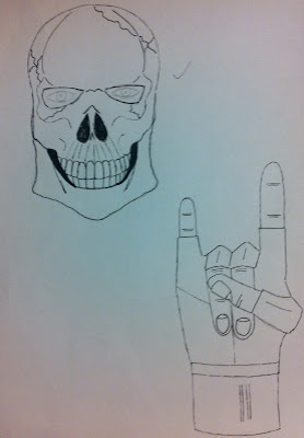
After more research and continued development, here are our finished Preliminary Task Digipack designs. Once our research into Thrash Metal Digipacks was complete we decided we would develop our original ideas further and as a result of this we have come up with a series of designs for a front cover as well as an inlay and a back cover. We have only drawn up our designs, we now plan to scan them into Photoshop and edit them effectively create a Digipack we feel will compliment the Thrash Metal genre. Here are our designs: 


We believe as a group that our research helped us greatly when It came to the design of these images for our Digipack. It helped us to choose and create a set of designs that would be believable and authentic for our Digipack. As a result of this we feel we have a greater chance of obtaining high marks.

Preliminary Task Digipack Songlist

For our Digipack we have decided to create a list of 12 songs. After some brief research we decided that the majority of songs symbolised true Thrash Metal inspired clearly by aggression as well as destruction and violent related inspiration. They consisted of mainly one to three words in length and were usually quite brutal. Here is the list of the 12 tracks that will be included on the back cover our or Digipack:

Hostile Takeover
Grave of Death
Fear
No Mercy
Cannibalism
Hopeless
We Force Hostility
Forgotten
Forgotten Pt. II
Broken Glass
The Unknown
Ripped Apart

Preliminary Task Digipack Fonts


As a result of previous Thrash Metal Digipack analysis I knew that almost every album had it's own distinctive or signature text as a result of this I decided to create a selection of fonts that fit this criteria to give us a variety of choices for when it comes to finalising our Digipack. 

Preliminary Task Digipack Album Name

Following on from our research into Thrash Metal artist names, we have done some extended research into Thrash Metal album names and as a result of this have decided to name our album No Mercy. The research we carried out provided us with the knowledge that most Thrash Album names consist of some form of relation to once again death and destruction. Having carried out previous research Into Thrash Metal Digipacks it was obvious that the album name would have some form of aggression within in it.

Here is a list of album names we rejected:

Unforgiven
Stabbed
Hatred
Trapped
Wounded
Gravestone
Fear
Anxiety

Carrying out the research we did helped us to choose a name that was both appropriate for the Thrash Metal genre and relastic which will help us to create a more believable and professional Digipack.

Preliminary Task Digipack Artist Name

After researching a number of Trash Metal artist names, as a group we have decided that our Digipack artist will be called Hostile Forces. Many of the Thrash Metal artists we researched such as Megadeth and Slayer have names that compliment the genre, including the classic conventional elements such as death and destruction, we also found that Thrash Metal artist names are usually between one and two words. Hostile Forces, incorporates both these elements, hostile representing hostility and destruction and forces representing the military and destruction.


Here is a list of other potential artist names we rejected: 

Forceable Hostility 
Military Force 
Corruption 
Denied 
Venomous Sin 
Blood Bath 
No Mercy 
Killers Revenge 
Slain 
Merciful 

Researching potential artist names was very useful when it came to choosing Hostile Forces as it helped us with our understanding of Thrash Metal artist names and help us to choose an appropriate and meaningful name. 

Thursday 28 June 2012

Filming Schedule For Preliminary Task

For Wednesday July 4th.

Meet in common room - 13:00
Obtain relevant costume and equipment - 13:05
Walk to location - 13:10
Film - 13:20
Walk back to school - 13:50

We decided to draw up a filming schedule as we felt this would be an effective way of making the most of the available filming time and to ensure we were punctual on location.

Preliminary Task Script

For the re-creation of Small Bump the script is merely that of Ed's lyrics so here are the lyrics to the opening minute.

You're just a small bump unborn in four months you're brought to life
You might be left with my hair but you'll have your mother's eyes
I'll hold your body in my hands, be as gentle as I can
But for now you're just a scan of my unmade plans 
A small bump in four months your brought to life 

And I'll whisper quietly and give you nothing but truth
If you're not inside me, I'll put my future in you 

It is important to have a sense of direction and scripture when it comes to filming our preliminary task as it will help to re-create the original video as best we can.

Preliminary Task Risk Assessment

I decided to draw up a quick risk assessment for the filming of our preliminary task.

Location - Walking to and from the surgery

Risk - Being run over or involved in an accident.

What we can do to reduce the risk - Remain safe when crossing both roads and walking along pathways. Always have someone on standby with a mobile phone in case of an emergency.

Location - Surgery

Risk - Tripping over steps upon entrance to the surgery.

What we can do to reduce the risk - Take extra caution when approaching the steps at the entrance to the surgery. Not only this but as the surgery is a medical practice, should we need any assistance help won't be too far away.

Location - Surgery

Risk - Tripping or falling over within surgery.

What we can do to reduce the risk - Once again we can take extra caution when inside the surgery as not to fall or trip over anything. As mentioned previous, should be do so help will be mere seconds away.

Location - Surgery

Risk - Fire

What we can do to reduce the risk - Always have someone on standby incase of an emergency. Leave the building accordingly if risk of fire and wait for further instructions from the staff at the surgery.

Personally I believe that it is very important be wary of any risks involved when filming. As a result of this, I believe this risk assessment will be very useful when it comes to remaining safe while on site.

Preliminary Task Costumes

It is important In any video for the mise en scene to be appropriate and correct. It is for this reason we have tried to dress the actor for our Preliminary Task in near to identical clothes to those worn in the actual video by Ed. This includes, stone washed jeans, a blue hoodie and a pair of nike trainers. We will also be dressing any extras In our video In basic and simple clothing as also seen in the video.

Wednesday 27 June 2012

Preliminary Task Actors

Actors are important In any music video. We have chosen to use Dan Rock as the actor for our Preliminary Task.

We chose to use Dan because he looks very similar to Ed and has experience in both drama and music related performance. In order to create the best video possible we decided he would be a perfect choice. We may also use Will Tickle (http://willticklemedia.blogspot.co.uk) as an extra in the background of the video if needed. 

Preliminary Task Weather Report

Usually when filming for either a Preliminary Task or actual coursework video I always believe It is important to check the weather report for the day of filming as It can be extremely useful. For example If we were planning to shoot on a sunny day and It was raining we wouldn't be able to film. However as we are filming purely inside, we don't have to worry about the weather or a weather report.

Preliminary Task Equipment

For our Preliminary Task we plan to use a three pieces of equipment and one piece of software. We plan to use a tripod to help film some of our shots, we intend to use a HD Cannon camcorder to record our footage and we plan to use an Apple iMac with Final Cut Express to edit our video. 

Preliminary Task Props

During our preliminary task we plan to use a variety of props to help better our re-creation of the opening minute of Small Bump. These props include trainers such as Ed Sheeran is seen wearing in the video and an X-Ray which we printed out and asked to use at the surgery for one of the shots needed in the opening minute. 

Some of the props we plan to use for our preliminary
We believe that with these props we can better our chances of being successful with this preliminary task given the limited resources available to us.

Preliminary Task Location Permission

In order to film at our desired location of the local doctors surgery, we had to gain permission from the doctors to gain access to film within the premises. We have been given permission to use the surgery to film between 1-2pm on the July 4th

Conformation that we have permission to use the surgery to film

Preliminary Task Location

For our preliminary task we have chosen to use the local doctors sugery for our desired location to film. First of all we had to obtain permission to film within these premises which we did successfully.

Newport Doctors Surgery where we plan to film our preliminary task
As a group, we believe that by using the surgery to film it will really help to add some authenticity to our re-creation and help us to obtain some good footage we which can then evaluate and breakdown into strengths and weaknesses in preparation for the creation of our own music video where we can draw on our experiences learnt from this task. 

Preliminary Task Shotlist

I decided to make a post about the relevant shots we will need when it comes to filming our preliminary task. Here is a basic outline of the shots we will need.

1. The first shot is a low angle shot of a clock within a hospital waiting room. We intend to bring a tripod to help execute this shot.


2. The second of our listed shots is that of an X-Ray projection. Once again we intend to incorporate the use of a tripod to help with this shot, however we may decide simply to take a photo for this shot instead as it should still express the same effect.


3. The next shot is of a medical waste bin. We plan to take a photo of this as keeping the camera steady and at the right level for this shot may be hard.


4. This fourth shot is looking in an empty hospital bed, once again I think we will either attempt to take a recording of this shot via the use of a tripod as the shot is a low angle one or simply take a photo instead trying to match up our shot with the one from the actual video.


5. Finally the last shot is is very simple but at the same time quite complex. The shot is that of moving tracking shot and starts to approach Ed from one end of the hospital waiting room, the camera gets closer to Ed as it pans round wide and eventually ends up facing Ed from the opposite side of the waiting room. For this shot we intend to prop the camera on a type of chair with wheels, we hope this will then enable us to wheel the chair across the room whilst trying re-create the shot the best we can.


Via the use of this shotlist I hope we will be able to re-create the video both successfully and appropriately. Although we have limited resources compared to what was used to film the real thing I believe we do well within this task.

Tuesday 26 June 2012

Preliminary Task Digipack Ideas

After researching and analysing numerous Thrash Metal Digipacks It became clear to me and the group I had been placed into for the Preliminary Tasks that when designing our own Thrash Metal Digipack It would need to include a number elements of such as destruction, death, graphic imagery as well as a distinctive text style or font. Including these key elements would enable us to create a Digipack as close to the real thing as possible and proving understanding of the genre enabling us to obtain full marks available. Here are some of our Preliminary ideas:


I believe it is important to draw up a variety of designs and images and then decide on a suitable creation rather than just designing one cover and sticking with it. This will help us to create a more professional Digipack and something we can learn from when It comes to designing future Digipacks. 

Thrash Metal Album Covers

After looking into Thrash Metal conventions and In preparation for the creation our very own Thrash Metal Digiapacks I decided to do some research into Thrash Metal album covers, from my findings I discovered that there are a number of reoccurring themes with the genre and there Digpacks found with in it. Violence and aggression seems to be a big part of Thrash Metal, this is portrayed in a vast number of ways throughout the genre.  Here are some examples of existing and famous Thrash Metal album covers.

Megadeth - Rust In Peace
Megadeath and Thrash Metal in general is well know for having graphic album covers, Rust In Peace by Megadeath is no exception. The use of their trademark mascot Vic Rattlehead is classic example of this graphically designed imagery that is such a big theme within Thrash Metal.


Warbringer - War Without End
Destruction is very much a big part of Thrash Metal this can be seen in Warbringers album cover War Without End. The album cover  depicts a Thrash Metal tank surrounded by fire, burning buildings, smoke and dead bodies as well as skeleton soldiers and a representation of the devil. This portrays huge destruction, even the text is of destructive nature with the use of a blood dripping effect on the album title. This is a classic example of a Thrash Metal album cover with a destructive graphic.
Motorhead - Iron Fist


The use of text styles and fonts is a big part of Thrash Metal this can be seen on almost every Thrash Metal album cover, each artist has it's on distinctive text style. This is so audiences can easily recognise the artist and relate to them every time they see the logo or text style. A great example of this is Motörhead's text or font style for their logo.


Metallica - Master of Puppets 
                                                                    Death is another re-occuring theme within Thrash Metal. The majority of album covers will feature some form of concept of death within it. Metallicas Master of Puppets album cover is a great example of this.
Slayer - South of  Heaven


Skull or skeleton imagery is another theme or piece of imagery that is big within Thrash Metal album covers. This is seen graphically in Slayers album cover South of Heaven. Not only this but this album also contains every single element of a Thrash Metal album cover listed above, destruction, a graphic design or imagery, death and also a a distinctive text style or logo.


From this is, it is evident to all that destruction, death and war appear to the main theme across all of the above covers. Not only this but cartoonist designs appear to be a big theme within the Thrash Metal genre, as a result of this observation we can incorporate these ideas and there respective elements within our own album cover and Digipack. 

Storyboard For Preliminary Task

I decided to create a storyboard to help us with the re-creation of the opening first minute of Ed Sheerans Small Bump as we believe it we help us greatly in the planning process of our Preliminary  Task. I took some screenshots from the original video and placed them in order with their respective shot durations. With this storyboard we as a group are able to see what shot types are needed within the opening first minute. It also helps us with other aspects of the re-creation such as costume and location as well as shot colour, tone and lighting.

0:00-0:02
0:02-0:04
0:04-0:06
0:06-0:08

0:08-0:20

0:20-0:48

0:48-0:56

0:56-1:03

Monday 25 June 2012

Ed Sheeran - Small Bump Analysis

For our Preliminary Task we were put into groups and given the task of re-creating the opening minute of a music video shot for shot. We chose to re-create the opening minute of Ed Sheeran's Small Bump, we decided we would create up to 1:03 seconds of the video as It was a good place to end the video both lyrically and shot wise. I decided I would analyse create a post about the opening minute of the video:


Ed Sheeran was born 17th February 1991 and is a indie singer songwriter.  Therefore the genre of this  video is both indie and that of singer songwriter. Throughout the duration of the video there is only a total of five shots. We will be re-creating all five of these. The video starts with a four shot montage of a hospital ward, including close ups of a clock, empty hospital bed and medical waste bin as well as a close up shot through a window of an x-ray projection. These shots are used to set the scene of the video, they also help set the tone, the song is about a miscarriage and therefore is something very serious and personal to be singing about. The cutting rate is quick during the opening four shots, this could be linked to the seriousness of the video and by quickly showing the audience that the video is set in a hospital it portrays the severity effectively. The fifth shot which is seen during the remainder of the opening minute and the rest of video is a moving shot of Ed sitting in a hospital waiting room tracking him as he sings the lyrics to the video, this gives the audience the impression he is waiting for some news or waiting to be seen himself. The Mise en Scene displayed within the video is very simple and portrays great realism, Ed can be seen wearing a hoodie, jeans and trainers an average set of clothes for someone his age, he's facial expressions are full or meaning and concern reinforcing the realism within the video for example he is not seen wearing expensive clothing or smiling. He is also seen with a beard and his trademark scruffy ginger hair, this gives the impression he may be stressed or anxious Other patients can be seen in the background of the video that are also wearing simple clothing and are also portrayed as looking anxious, there is also a doctor who is seen wearing a stereotypical doctors uniform, again enforcing severity and realism. The lighting also helps reinforce the realism with video, the lighting is high key and represents the type lighting that you would expect to see in a hospital waiting room. Ed can be seen singing every lyric during the opening minute however as the camera gets closer to him there is more emphasis on the lyrics "I'll give you nothing but truth" and "I'll put my future in you" these lyrics are quite personal and create the impression of great meaning within the video. 

By analysing the opening minute in which I will have to re-create with my group I now have a much better understanding of the concept of the video. I now know the type of shots, the mise en scene, the lyrics and as well lighting and location. This will be extremely helpful when it comes to re-creating the opening minute shot for shot. 

Preliminary Task

Today we were put into groups for our Preliminary Tasks, I was put In a group with Jack Carrington (http://jackcarringtona2.blogspot.co.uk) and Will Tickle (http://willticklemedia.blogspot.com). We have been give then task of re-creating the opening minute of a music video shot for shot, as well as this we have to create our own Digipack.

Ed Sheeran
For the re-creation task we have chosen to do Ed Sheeran's Small Bump. We chose this video because we believe It will fairly straight forward to re-create and will help us to achieve high marks in the process, not only this but we have the potential of using a location very similar to the one seen in the video itself and we also have a potential actor who would be perfect to star in the video.

Sunday 24 June 2012

Thrash Metal Conventions

Today we were given the genre we would be creating our Preliminary Digipack for. I was given the genre Thrash Metal. So I decided I would create about the conventions of Thrash Metal and what they entail, here is what I found:

Thrash Metal originated in the late 1970's and early 1980's. It began when a series of mostly American bands decided to experiment with British Heavy Metal and began mixing it together with the aggression and speed of Hardcore Punk. Thrash Metal is a sub genre of Heavy Metal and is seen to be much more aggressive than some of the other sub genre's that came out of Heavy Metal such as Speed Metal and Glam Metal. As the 1990's progressed a variety of other sub genre's were born such as Death Metal and Black Metal. As time went on all these sub genres began intermitting with each-other for example artists that had all the traits of a Thrash Metal band would start to incorporate aspects of Black Metal for example the use of synthesisers. Thrash Metal itself has recently seen a resurgence In recent years It is believed this is due to the genre's high energy and recklessness and appealing to the younger generation. 

Metallica - The Black Album
Thrash Metal is known for it's fast tempo, its complex guitar rifts and double bass drumming as well as it's famous guitar solos. The vocals associated with Thrash Metal can consist of anything from singing to shouting. Lyrics include  addiction, isolation, suicide, warfare, murder, destruction as wealth as disease and death.The guitar solos are usually fast and aggressive, they are well known for their shredding style. Thrash Metal has an extremely aggressive drumming style part of the reason the the genre has such a fast tempo and beat. Drummers usually use either two bass drums or a double bass pedal to creating a dominant thumping beat. Most Thrash Metal bassists use a pick to keep up with the other instruments however some use their fingers such as Cliff Burton. Several bassists also use a distorted bass tone.

Thrash Metal artists include the likes of Metallica, Megadeath, Slayer and Anthrax. These are knows the "Big Four" and were the dominant forces within the Thrash Metal scene throughout the 1980's. Other Thrash Metal artists include Moral Sin, Vio-Lence, Forbidden, Razor, Death Angel, Dark Angel, Holy Moses, Overkill, Onslaught, Metal Church, Grinder, Exodus, Testament, Iron Angel, Discharge, Destruction, Nuclear Assault, Kremate, Distortion, Demise, Demons Dream, Motörhead, Sinner, Intruder, AC-DC, Artillery, Sacred Reich, Turbo, Mercyful Fate, Messiah Force, Coroner, Defiance, Virus, PC Death Squad, Slaughter and Macabre. 

Death Angel - The Art of Dying
Thrash Metal Digipacks usually consist of various symbols and imagery relating to death, danger, suffering and destruction. Examples of this can be found In a variety of album covers from the likes of Metallica as seen above with the snake symbolising potential danger and death. Other examples can be found when looking at Albums such as Reign In Blood by Slayer as seen below. Most Thrash Albums will also have their own unique font or text style to compliment their destructive covers a classic example of this is Megadeath's logo, another example would also be the Death Angel logo to left of this text. Thrash Metal album covers are often dark with mainly red, black and white colour schemes however some albums have golds and greens as seen above. Thrash Metal album cover are usually cartoon or computer generated, with creative and comic book style designs very rarely will it ever be of the band.

Slayer - Reign In Blood 
Thrash Metal music videos are usually made up of the band performing. Sometimes this will be taken from concert footage with focus drawn on the key elements of Thrash such as shredding guitar solos, big bassy drum beats and destructive lyrics. However some Thrash Metal videos explore a narrative route also, for example Metallica's famous "Enter Sandman" video as well the narrative seen in Megadeaths "Symphony of Destruction" video which doesn't even feature the band in it at all. 


Analysing these conventions of Thrash Metal will be extremely useful when it comes to designing my own Thrash Metal Digipack, I will know what artists to look at for inspiration which will be a great help. I will be able to use my knowledge about the what I have learnt and justify my decisions when creating my own Thrash Metal Digipack.

Saturday 23 June 2012

Chase & Status - Time ft. Deliah Analysis

Following on from my analysis of The Killers - Somebody Told Me, I decided to Analyse the video Time by Chase & Status. I felt I should try looking at analysing a variety of videos from different genres to see how each genre differs and how their approach to videos changes as well as the different conventions they portray. 


Chase & Status produce electronic music such as Dubstep and they are originally from London. The band was formed in 2003 and since then they have produced two studio albums. Time is taken from their second studio album titled "No More Idols" and features british singer songwriter Deliah. The story within the video is about a teenage daughter who witnesses her mother being abused by her father. As the video progresses and as the abuse gets worse it effects the daughter more and more until she eventually takes action to protect her mother by phoning the police and having her own father arrested. The beginning of the video starts off with an a close up shot of the girl texting with a worried look on her face, however this is quickly contrasted by establishing shot of the family, you are given the impression that the family are happy as through a variety of medium and close up shots the family can be seen smiling and playing together. There is use of high key lighting to bring out brighter colours within the opening few shots and the Mise en Scene also gives the impression that the family are happy or content, all members of the family are seen to be wearing average clothes implying that they aren't short of money and live comfortably. Having said this the older daughters hair is quite messy, giving the impression she may be stressed or concerned about something. The mother is seen to be wearing a yellow jumper, yellow being a warm colour giving the opposite impression in that she is happy. As the video progresses the mood of the video changes, the lighting as well as the Mise en Scene suddenly become much darker this is to coincide with the escalation of abuse. The older daughter can be seen wearing very old and and scruffy clothes, bruises appear on the mothers face and the father is portrayed as being very aggressive. All this is shown through a variety of shots such as close ups, long and medium shots as well as high and low angles shots also giving the video great diversity with it's angles from which to display the action effectively. The cutting rate between the scenes of abuse is fast this compliments the fact a fierce confrontation involving violence is taking place, in contrast to this the scenes in which the there is no abuse taking place such as when the family are sitting down for breakfast the cutting rate is much slower representing a feeling of calm, the lighting and Mise en Scene also brighten up, brighter clothing can be seen again. All through the video their is younger daughter who is made out to be oblivious as to what is taking place, this could represent the fact that no-one knows about the domestic violence taking place. There are three locations within the video, one is the family home and the other is a prison. The third is a series of shot's In which the audience see Delilah singing the lyrics to the song, this is the performance aspect of the song and Is shown through mainly close ups and medium shots. There is emphasis on certain lines such as "I will wait for you, if thats all you need" this maybe because certain lyrics relate to certain parts of the video. An example of this is when the father is portrayed as an alcoholic and the mother always seems to forgive him for what he does to her, the lyric could represent the fact that the mother believes the father needs help and is willing to wait for him to change if that will make things better. At the end of the video, the father is seen being carried into a jail cell, there is a birds eye view of him within the cell and this gives the audience the impression that he feels isolated in prison, this could represent how the mother would have felt, trapped in his world of hurt and abuse.

As previously mention I believe that It is important to gain an understanding of how music videos work and what the difference in genre can mean a difference In a music video, the video seen above is very different to the rock performance In the desert by The Killers and I will take this into consideration. Analysing a variety of videos such as this one will be hugely beneficial when it comes to creating my own.

Richard Dyers Star Theory

Today I was introduced to Richard Dyers Star Theory. Richard Dyer was born in 1945 and since then has gone onto become an English academic. Dyer specialises in cinema and has created a variety of theories and beliefs over his 50 year career. One of his theories is his Star Theory, Dyer argues that people look up to stars as role models and that a star is made up of various key factors such as Image, Audience, Culture and Personality. I decided I would make a post about Dyers Theory, here Is what I found: 

Richard Dyer
Stars As Constructions

Lana Del Ray
Dyer believes artists are constructed through artificial images such as advertising, films, magazines and music. He claims that consumers prefer artists to convey their true emotions themselves and not be groomed by record labels who try to create a fake image for them. This creates a Unique selling point for the artist as it differentiates them. An example of this would be Lana Del Ray as she is marketed as being extravagant and different to others artists that produce similar music to her within the music industry.


Industry And Audiences

Richard Dyer also believes that stars are manufactured to make money for their record labels by appealing to target audiences. As a result of this record labels have to cater different artists for certain target audiences as there are both niche and whole markets. Examples of record labels doing this can be seen through Mirror branding, both Rage Against The Machine and Joe McElderry are signed to Sony Music.

Rage Against The Machine


Joe McElderry


Ideology And Culture


Another one of Dyers beliefs within his Star Theory is that artists become trendsetters in the sense that audience members will imitate hairstyles and artists clothing styles. Artist may have certain religious beliefs and cultural values that audiences may also pick up on if shared by the artist. The most common types of media that consumers or audience members will be able to obtain all this information and keep up with the latest gossip are magazine articles, websites and blogs. An example of this would be OK magazine and an example of a trendsetting artist would be Cheryl Cole and her variant hair styles.


Character And Personality

Finally Dyer believes that stars are presented as 'real' human beings and that they are representations of the contradictions as well as reinforced ideas see in the music industry. Stars support the idea of dominant ideology, seen as a glorified version of "us" the audience or consumer. Not only this but he argues that seeing a stars lifestyle through the internet, magazines and newspapers will feel closer to them. Development in social media now means that audiences are able to interact with the day to day life of a star.

It is important to understand theories and ideas such as this one to understand certain aspects of my media coursework. It will also be useful when it comes to analysing artists in the future. Whilst analysing music videos I will be able to use my knowledge to develop a greater understanding.

Tenacious D Rise of the Fenix Digipack Analysis

I decided to post a picture of some Digipack analysis I did for the album Rise of the Fenix by Tenacious D. Here is my analysis: 


It is important to analyse a variety of different Digipacks to gain a wider range of knowledge about how various signs and symbols within them and what they can be interpreted as meaning. Not only this but learning how genre effects the style and conventions of a Digipack will also be important when it comes to designing my own. 

Friday 22 June 2012

Nirvana Smells Like Teen Spirit Analysis


In the video "Smells Like Teen Spirit" by Nirvana is set in a school gym and given a sepia filter effect throughout, what this does is help the audience link to the lyrics to the actual location and setting of the video, the stereotypical view of teenagers being rebellious or unclean. The genre of which this video and Nirvana come from is Rock and the rebellious attitudes shown in this video symbolise stereotypical conventions from the rock genre such as crow surfing and mosh pits, heavy focus on drums, a guitar solo and the destroying of instruments. Not only this but the Mise en Scene of the video also draws focus to Rock Genre with the instruments in which the band are playing such as drums, guitar and bass. As well as this, the costumes featured in the video represent that of Rock but also have a clear link to the actual title of the song and that lyrics as the majority of people in the video are "teenagers" they are seen to be wearing jeans and t-shirts, something that was very popular within the genre at the time this video was released. Not only this but there also a group of cheerleaders that can be seen in the video wearing stereotypical costume, this helps to emphasise the location of the video being at a school or high school. As a result of this also, the target audience for this particular artist and the song it's self would be between 16-24,  both "teenagers" and students. The cutting rate in this video is that of a typical rock video, cutting between the performance of the band and the crowd moshing throughout the majority of the video. The image of the band in this video is one that agains fits into the title and the lyrics of the song, with them looking similar to the teenage crowd and with the band acting rebellious by causing destruction in the schools gym this could be seen as very stereotypical both within Rock itself with it's destructive reputation but also with rebellious teenagers within school. Both the band and crowd are seen to also be wearing quite dark clothing as well which fits in with the setting of the video. The performance the band give throughout the video again is that of a typical Rock concert, whereby after each chorus the band gets the crowd moving more and more until eventually the song ends and the band destroy there instruments, something which again may appeal more to teenagers. Throughout the video I believe that the band whilst causing destruction are also portrayed as very likeable and respected people especially within the world of Rock with the close up shots of the crowd moshing and the band playing there instruments. Kurt Cobain can be seen singing into the camera as well during the video, making the video feel more personal as if he is singing to not just the audience in the video but and audience watching the video. The video contains a fast cutting rate with a variety of different shots, such as close ups, long shots and also high angle shots and a panning shot at the start of of the video to set the scene which keeps the audience interested in the video. There is also a variety of shots that show a cleaner dancing to the music, he is very much older than anyone else in the video, what this may represent is an older generation reminiscing or wanting to re-discover there youth.


The Killers - Somebody Told Me Analysis

One of the most common ways In which artists are portrayed or represented is through their music videos so I decided to analyse some as I will eventually have to create my very own music video for my coursework. I decide to analyse The Killers - Somebody Told Me: 


The video is set in desert in which the band can be seen playing into the early morning. There is only one location throughout the video and the Mise en scene remains the same for the duration of the song. The Mise en Scene is mix of classic rock with jeans and t-shirts and more 21st century rock in the sense there are also members of the band wearing blazers, cardigans and a polo shirt. The majority of the video is purely the band performing with the main focus on the lead singer. However there are cuts to silhouettes of women dancing in-front of a screen lit up by the bands name, this occurs mainly in the chorus. This could represent a link to the lyrics when it says "I had a girlfriend" connecting the song to the women in the video, the placement of these women and their actions will also appeal to male viewers as It implies sex appeal, where as the band themselves may appeal more towards a female audience. There is a very fast cutting rate at the start of the video before the lyrics begin and before the lead singer has properly been introduced, this could be done to create suspense and excitement for the audience as they will be eager to the performance to begin. The band can also been seen as silhouettes at the start of the video, this could be linked to the silhouettes of the women later on and could portray that they are similar linking In with the lyric "you had a boyfriend that looked like a girlfriend". In the background of the video there Is a footage of the band playing to the song In the day time as well as a "Killers" light-show, this could imply that the band having been playing although the day and are playing into the night, not only this but the "Killers" imagery could be in place to make sure people know who they are by the end of the video if they didn't already. The images of the band playing during the day creates the impression that the band are hardworking or even "hardcore" a classic convention of the rock genre, which will appeal to their audience greatly. The performance is very lively from the lead singers point of view, he is seen to be moving around a lot during the video this could be emphasise that he is the lead and the attention should be drawn to him. Their is also heavy focus on the drummer, another classic rock convention. The band look at the camera on several occasions throughout the performance giving the video a more personal feel. The lighting used in the video appears to be low lit spotlighting this is a clever way of drawing focus to certain aspects of the performance. The positioning of the band is also that of a classic Rock band with the drummer at the back, lead in the middle and the two guitarist either side, The true rock audience will be able to relate to this. Throughout the video there are a range of different shots such as close ups, long and medium shots as well as low and high angle shows also, what this does is create a more interesting and enjoyable performance via a variety of different aspects. When the video reaches the end and the band finish performing it gives the impression they have just finished a concert, this could be to try and encourage the audience to see them live as the type of performance seen in the video is how they will perform live at a concert. Overall I believe the video works well, although the video is more Pop Rock than true Rock it is still a very clever and successful use of lyrics, performance, editing, Mise en Scene and sound. 

It is useful to look at music videos, to understand more about artists and how they are portrayed through their own videos. This will be very helpful for me when it comes to creating my own music video, I will look to videos such as this one If I were to choose the genre of Rock. 

Thursday 21 June 2012

Rihanna Loud Digipack Analysis

Following on from my previous Digipack analysis, I decided to another analysis of Rihanna's - Loud album:

Loud is Rihanna's 5th studio album and was released by Def Jam records on November 12th 2010. The  Digipack appeals to both Rihanna's female and male audience members but in different ways. The album cover Is extremely feminine. Rihanna's face is the focus, her hair, make up and facial expressions  all represent great beauty, however they also ooze sex appeal. For example, Rihanna's bright red lipstick could be seen as a sign of beauty or innocence, however it could also be seen as sex appeal to some certain parts of her audience, this is further developed with the showing of her bare shoulder  this combined with both her red hair and lipstick create a sense of sexual interest and this is something which will appeal greatly to her male audience members. However her female audience members will also appreciate these features of Rihanna displayed on the front as they will instead interpret it as a sign or symbol or Rihanna's beauty. The same could be said for Rihanna's facial expression, It could be seen as quite a shy or innocent expression where as it could also be seen as a more sexual expression, her line of sight is not in contact with the camera instead she appears to be drawing focus on her bare shoulder which as previously mentioned could be seen as a representation of sexual interest again appealing to her male audience. The text is very simple, it's bold to grab the audiences attention, the white stands out well against the pink and the colour of Rihanna's skin and it effective way of making sure they audience know the title of the album. Rihanna has left her name off the front cover, this is risky but is relying on the fact that people already know who she is. There is some symbolism of wealth through the ear ring that can be seen behind her hair, this gives the impression she has money to spend on jewellery and that she values jewellery. This and the tattoo on her neck add a more personal touch to the cover as tattoos and jewellery are quite personal, this will appeal more to her female audience members. Having said this I believe that her front cover appeals more to her male audience as it is quite sexual having said this will also appeal to her female audience as they will connect with Rihanna's longing to look sexy and desirable, they will also relate to Rihanna as looking both beautiful and innocent through the image presented.


The Inside cover of the album is very similar to that of the front however more of Rihanna is exposed, she can been wearing a dress and laying in a field of red flowers, continuing the red or pink colour seen which can again be represented as beauty and very feminine. However she can be seen wearing a low cut top which again makes reference to sex appeal. The CD covers themselves are that also of pink flowers which can be seen as both personal and feminine, appealing to her female audience members. 


The back cover is very different to the front. Rihanna can be seen In a different outfit, this time you can see her whole body and she is looking directly at the camera. She can be seen striking quite a sexual pose and there is more skin on show, what this shows is that the sex appeal is very much still there. The fact that Rihanna is looking at the camera means that It's more personal this could be linked the song list to the left of the back cover, implying the personal side to some of her songs. The songlist and text on the back cover is very subtle, very simple. It's very obvious that the back cover is focused very much on Rihanna and less so about her songs. The legal documentation, websites on how to contact Rihanna and a barcode are visible on the back cover also as would be expected. 

I believe that It is important for to understand as much as I can about Digipacks so I can best prepare myself for when I have to create my own. I feel by analysing Digipacks such as this one I will benefit with my understanding of the meaning behind certain elements within a front or back cover and this will really help when it comes to planning and designing my own Digipack. 


Digipack Analysis

Following on from my previous post about Digipacks, I decided to do some Digipack Analysis. Here is what I came up with:

Katy Perry - Teenage Dream


The background for this Digipack is that of clouds, this could signify that Katy is an "angel". She is seen to be wearing no clothes and her bottom is covered by merely a cloud, what this portrays is sex appeal. Although Katy's primary target audience is young teenage girls, she also appeals to a male audience as well. Her red lipstick also signifies sex appeal, however it also gives the impression that she may be a princess something she likes to portray herself as to appeal to her target audience of young teenage girls who look up to her as a role model. The text used on the front cover of the album is made to look like sweets or candy with cartoonist designs again appealing to her target audience. Teenage Dream the name of the album is located underneath Katy and portrays that of a lollipop design grabbing the audiences attention. Katy is looking straight at the camera this makes it more personal, her facial expression could be seen as both seductive and also happy appealing to both her male and female audience member. Overall I believe the album image is one in which Katy is trying to portray herself as a princess or angel in a bright and vibrant way, however she has produced a degree of sex appeal also so not to alienate her male viewers. 

Tinie Tempah - Disc-overy
In this Digipack Tinie Tempah Disc-overy, the background seems to be that of space, this could symbolise that he is from another planet or "out of this world". The text found on the front cover is Tinie's trademark text that can be found on his single and EP releases, the audience will easily relate to this. The fact he is wearing sunglasses again is another trademark of Tinie's but also portrays hidden identify, perhaps wanting to hide away from the spotlight. His watch may symbolise his power in the music industry and wealth which will appeal to his audience or young males. The fact he seems to be clutching what appears to be a city may portray that he is in control or plans to or has taken over the world through his music. Tinie is centre frame drawing the audiences attention directly to him. The facial expression used gives the impression he is very focused. There is almost a spotlight surrounding him creating a glow which could portray that he is special or gifted, this again draws the audiences attentions towards him and will appeal to his audiences of both male and females, his masculinity within the cover will appeal to his female audience. The overall image I believe Tinie is trying to create is that of power and control, as he remains focused on succeeding in the music industry and becoming a global hit. 

50 Cent - Get Rich or Die Tryin'
The background for 50 Cent's Get Rich or Die Tryin' Digipack is red, making 50 stand out against it drawing the audiences attention to him. There is what appears to be a bullet hole centre frame, grabbing the audiences attention and focusing it on a necklace of a cross. What all this symbolises is religion, power, wealth and strength all of which 50 Cent is heavily known for. His watch also symbolises this. 50 has his trademark logo in the top right of the cover, his audience will easily relate to this. The text for title of the album is different and is more of a "gangsta" style of writing, 50 Cent is known as a gangsta and with this style of text helps symbolise this. 50 is looking straight at the camera making the cover feel more personal as if he is looking at the audience, however his facial expression is fierce and aggressive and this could be seen as a warning or threat to his enemies, the fact his has no top on and his tattoos and muscular physique are on show could also symbolise this. The parental advisory sticker in the bottom left on the cover again symbolises power but also attitude and reputation. 50 is known for speaking his mind and not holding back, something his fans find hugely appealing. The overall image I believe this cover is trying to create is 50 showing off his power, his faith and his wealth and also showing aggression to his competitors or enemies. 

JLS - JLS
In this Digipack the background is a greyish white, the band are in a quartet formation centre frame with the use a mid body shot drawing the focus directly on them. The cover contains the bands trademark logo, with the only colour coming just under the logo with a different colour symbolising a different member of the group. The group are looking directly at the camera, giving a very personal portrayal which will appeal to their young female audience greatly. Each member of the group has a different hairstyle and each are wearing different outfits however all are dressed in black, this could symbolise the different in each member of the group and their variation in style however also there unity as a group again appealing to their target audience of young female girls. The facial expressions of the group also portray a sense of focus but also seduction, introducing a degree of sex appeal into the Digipack. JLS have self titled their album "JLS" this could be seen as a denotation of the group. I believe the overall image being created here is that of unity, style and masculinity all of which is designed to appeal to there audience.

Rita Ora - ORA
Rita Ora's Digipack titled ORA has a white background, this makes Rita stand out against it. There is little colour, with the only the text and border being gold. This could be to emphasise simply the artist and the title of the album. Rita is centre frame and looking directly at the camera drawing attention to herself and making the cover feel more personal. Rita's facial expression is that almost of surprise this could pose reference to her shock at how quickly she has risen to fame. She is covering one of her eyes with her, this could represent hidden identify and how she wants to shy away from some of the fame and attention she is receiving.  High key lighting is used to draw attention to Rita. Her watch could be seen as a symbol of wealth and power. The necklace she is seen wearing looks similar to a chain, this could represent how she is now locked into the music industry, no escaping the fame or spot light. Even though there is no colour in the actual image of Rita, it's clear that she is wearing a form or bright lipstick, this combined with the fact she doesn't appear to be wearing any clothes and is almost trying cover herself up creates sex appeal directed at her male audience members. Her wavy hair could be seen as a sign of beauty and passion, this will appeal to her female audience, especially young teenagers who look to her as a role model. Rita Ora has also self titled her album giving it a more personal feel, Ora also has a double meaning which is another reason why she has most likely done this. Overall I believe that the image that is being portrayed is that of a mixture of beauty and sex appeal as well as the shock at how quickly Rita has risen to fame and how successful she has become in such a short space of time. As a result of this symbolism relating to wealth is also visible. 

I believe that by looking at Digipacks and analysing them it will be hugely beneficial for when I come to design my own Digipack in the very near future. I will be able to relate to signs and imagery much easier, I will also understand the concepts of Digipacks as well as what they involve and how they work.